Room Color Visualizer
Preview paint colors on walls, ceiling, trim, and more. Click a region or select it below, then pick a color to see it applied instantly.
Select Region
Main Color
How the Room Visualizer Works — and How to Choose Wall Colors That Hold Up in Real Light
How the preview is built: one real photo, three paintable regions
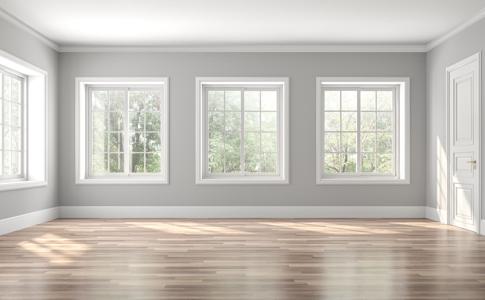
The visualizer starts from a photograph of an actual room, not a flat illustration or a blank template. Three areas are traced over that photo as paintable regions: Main — the largest wall, the field color that fills most of your view; Accent — a secondary wall used for contrast; and Trim — the crown molding, baseboards, and window frames. Select any region by clicking it directly on the room photo or using the Main, Accent, and Trim buttons, then pick a color with the picker or type in a six-digit hex code. The room repaints instantly, so you can try a shade, change your mind, and try another in seconds. The Main region is the color you would buy the most of, so it is worth settling first.
The color is not pasted on flat. It is blended into the photo's own light and shadow, so the same paint reads darker in the corners and where furniture casts shade, and lighter where the window falls across the wall. A swatch card hides that variation; a real wall shows it, and so does the preview. Painting the color over the photo's lighting instead of covering it is what makes the result closer to a finished wall than a solid block of color would be. When a shade looks right, select “Find Paint Match” to pull the closest real paints from 13 brands — each result links to its full color page, where you can read its undertone and see cross-brand equivalents.
Use LRV to match a wall color to your room's light
LRV, or Light Reflectance Value, is a 0-to-100 measure of how much light a color bounces back into the room. Black sits near 0, pure white near 100, and most wall colors fall somewhere between — a soft greige around 55 to 65, a mid-tone blue closer to 30. Every color page on Paint Color HQ lists the LRV, which is the fastest way to judge whether a shade will lift a room or weigh it down. Once the visualizer hands you a match, open its page and check that number before you commit. A mid-range LRV, roughly 45 to 60, is the most forgiving starting point if you are unsure — it holds its color in shade without darkening the room, which is why so many popular greiges and soft sages land there.
A dark or north-facing room gets cool, indirect light for most of the day, so it usually wants a wall color with a higher LRV to keep it from reading gloomy; a brighter wall also makes a small room feel larger. A bright, south-facing room can carry a lower-LRV color — a deep green, a charcoal, a saturated navy — without feeling closed in, because there is more daylight for the color to work with. The Main wall drives the room's overall brightness because it covers the most surface, so choose it first by LRV, then build the accent and trim around it. Grays are where this matters most: two grays that look alike on a chip can behave differently on the wall once one reflects more light than the other. The gray family page groups them by shade, and the methodology page explains where the color data behind each page comes from.
Why the on-screen preview will not match your painted wall exactly
The preview is a starting point, not a guarantee. A screen builds color out of emitted light; a wall builds it out of reflected light, and several things shift between the two:
- Your device. Your monitor or phone has its own brightness and color calibration, so the same hex code looks slightly different on every screen.
- Your room's light. The preview uses one photo's fixed lighting, while your room has its own — warm 2700K bulbs push a color yellower, cool 4000K bulbs push it bluer, a north-facing window runs cool and a south-facing window runs warm.
- Sheen. The same color in flat, eggshell, and semi-gloss reflects light differently, and a glossier finish looks lighter and shinier than the preview suggests.
The fix is physical. Get samples of your top one or two colors, paint a patch on the actual wall, and look at it in both morning and evening light before you buy gallons. Peel-and-stick samples made from real paint or a small sample pot both do the job. The visualizer's value is speed — it narrows a wall of options down to a short list in minutes — but a sample on your own wall is what confirms the winner.
Build a wall, trim, and accent scheme that works together
Main, Accent, and Trim are not just three color slots — they are the structure of a real scheme. Trim usually contrasts the wall: a clean white or off-white frames a colored wall and makes molding and window casings stand out. The wider the gap in lightness between wall and trim, the crisper and more defined those edges look; a narrow gap reads soft and understated. For an accent wall, a deeper version of the main color anchors the room without competing with it.
What holds a scheme together is undertone, not raw hue. Two grays can read as near-identical and still pull in opposite directions once they are on the wall — one warm toward pink, the other cool toward green — which is how a wall and its trim end up clashing even when both are called “gray.” Keep the main wall, accent, and trim in the same undertone family, and check the undertone tag on each color page before you buy. Our guide to understanding paint color undertones covers how to tell which way a color leans, and the compare tool puts two finalists side by side so you can see the difference before it reaches your walls.
A simple proportion keeps a three-color scheme balanced: let the main wall color dominate, give the accent roughly a third of the visible color, and keep trim as the smallest, sharpest share. You do not have to follow it to the letter, but if a room feels busy in the preview, it is usually because the accent is doing too much. Pull it back toward the main color's family and the scheme settles.
How to Use
- Select a region by clicking directly on the room image or using the buttons below it.
- Pick a color using the color picker or type a hex code. The room updates instantly.
- Find paint matches to discover which real paint colors from Sherwin-Williams, Benjamin Moore, Behr, and other brands are closest to your selection.
Screen colors differ from physical paint. Always verify with a swatch or sample before purchasing.
What the Room Visualizer Does
The Paint Color HQ Room Visualizer lets you preview paint colors on every surface in a room before you commit to a single can of paint. Click on any region — walls, ceiling, trim, accent wall, or floor — to select it, then choose a color from the picker or type in a specific hex code. The room updates instantly so you can experiment freely without any waiting.
Once you find a color you love, use the "Find Paint Match" feature to see which real-world paints from 14 major brands — including Sherwin-Williams, Benjamin Moore, Behr, Valspar, PPG, Dunn-Edwards, and Farrow & Ball — are the closest match. Every suggestion links to its full color detail page so you can explore undertones, coordinating colors, and cross-brand alternatives.
Why Preview Before You Paint
Paint always looks different on a full wall than it does on a tiny swatch card at the store. Lighting conditions, room dimensions, and the colors surrounding a surface all change how a shade is perceived. A warm beige can read pink under cool fluorescent light, and a soft gray can shift blue next to certain wood tones. Previewing colors in a room context helps you catch these surprises before they become expensive mistakes.
Testing digitally also saves real money. Instead of buying three or four sample pots at $5 to $8 each, you can narrow your choices down to a single front-runner in minutes. This is especially valuable when you are planning a whole-room color scheme with coordinated walls, trim, and an accent wall — getting that balance right on screen first means fewer trips back to the paint counter.
Tips for Getting the Most Out of the Visualizer
Start with the wall color. Walls cover the most surface area, so they set the overall tone for the room. Pick your wall shade first, then build the rest of the palette around it.
Use contrasting trim. White or off-white trim against colored walls is a timeless combination that makes architectural details pop. Try it in the visualizer to see how much definition trim color adds.
Experiment with the accent wall. A single bold wall can anchor a space without overwhelming it. The accent wall region lets you test dramatic colors in a contained way before committing to an entire room.
Convert custom colors to real paint. Any color you pick — even a custom hex — can be matched to a real product from major brands using the "Find Paint Match" button. This bridges the gap between inspiration and a trip to the store.
Use our other tools alongside the visualizer. Once you have colors you like, open the Color Comparison tool to see them side by side, or try the Palette Generator to build a fully coordinated scheme. If you are unsure whether a color runs warm or cool, our guide on understanding paint color undertones breaks down what to look for.
Found a color you love on the wall? Order peel-and-stick samples to see real paint on your wall before you commit — Samplize: buy 8 peel-and-stick samples, get 2 free.
8 samples → 2 free · 12 → 3 free · 20 → 3 free + free shipping
Shop peel-and-stick samples →Affiliate link — Paint Color HQ may earn a small commission at no extra cost to you.