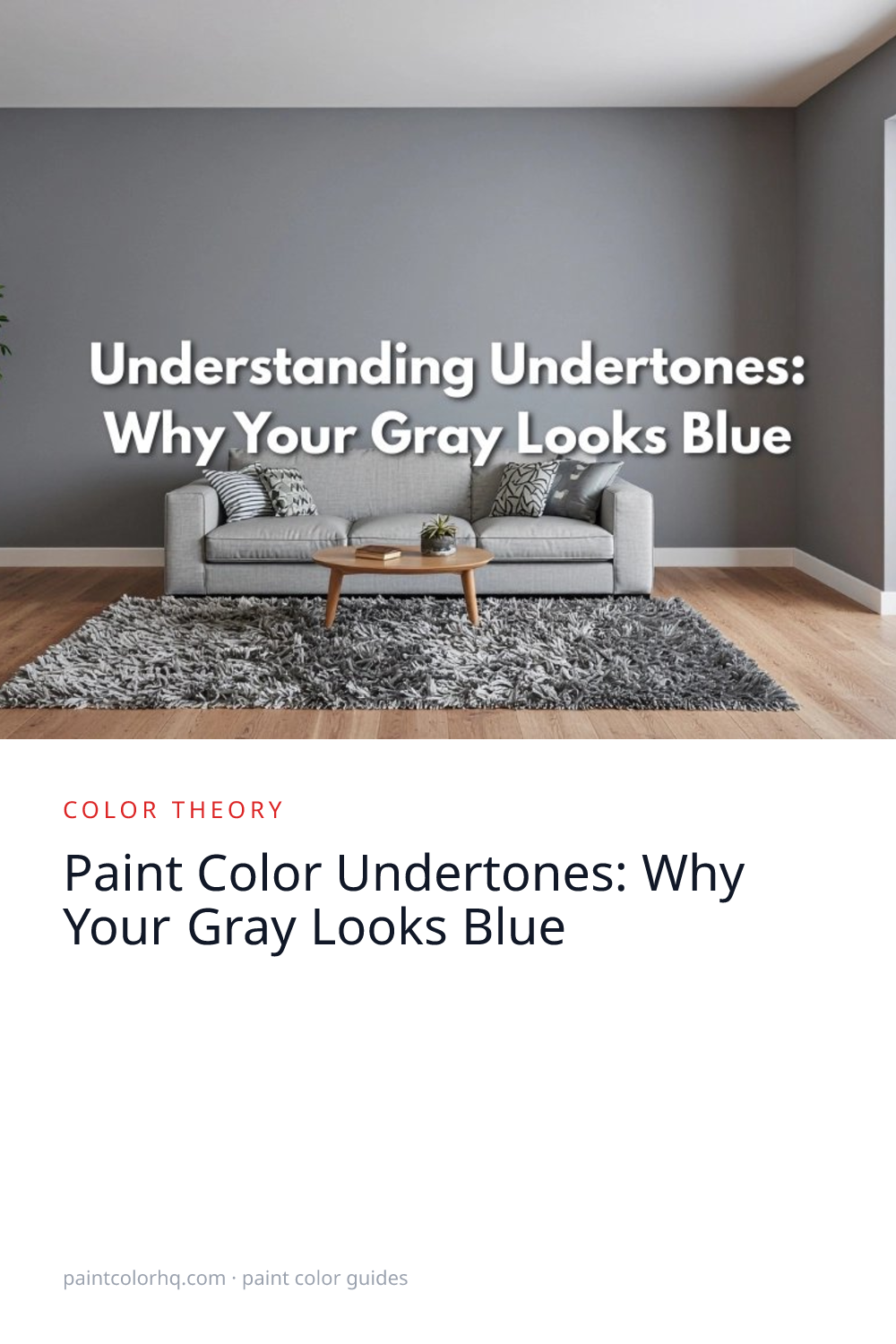

Paint Color Undertones: Why Your Gray Looks Blue
You picked a gorgeous gray from the paint chip wall. You painted the whole living room. And now it looks… blue. Or purple. Or green. Welcome to the world of undertones — the hidden pigments lurking beneath every “neutral” color.
Based on our analysis of 26,000+ paint colors across 13 brands using CIEDE2000 color science (the CIE 142-2001 industry-standard color-difference formula), we've found that the majority of grays carry hidden blue undertones — here's how to spot them before you buy.
What Are Undertones?
Every paint color is created by mixing pigments, and the secondary pigments that give a color its subtle bias are called undertones. A gray might be mixed with blue, green, purple, or brown pigments — and while the color still reads as “gray” on a tiny paint chip, those undertones become unmistakable on a 12-foot wall with natural light bouncing around. This concept applies equally to whites and beiges — browse our beige color family to see how undertones shift across warm neutrals.
The Most Common Gray Undertones
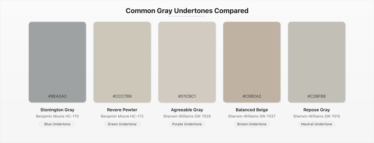
Blue undertone: Stonington Gray(Benjamin Moore) — looks cool and airy in north-facing light, but can feel cold in rooms without much natural light.
Green undertone: Revere Pewter(Benjamin Moore) — in certain lighting, warm grays with green undertones can look almost sage-like. This is especially common with greige colors.
Purple undertone: Agreeable Gray(Sherwin-Williams) — some warm grays carry a slight violet cast, especially under LED lighting.
Brown undertone: Balanced Beige(Sherwin-Williams) — these “greige” colors are the most popular neutrals because the warm brown undertone prevents them from feeling cold.
Warm neutral undertone: Repose Gray(Sherwin-Williams) — one of Sherwin-Williams' most popular grays, Repose Gray sits right in the middle with a subtle warm undertone that keeps it from leaning too cool or too warm. It's a true “balanced gray” that works in almost any lighting.
How to Identify Undertones
1. Compare against a true reference. Hold your paint chip next to a piece of pure white paper. The undertone will suddenly pop — you'll see the blue, green, or purple cast that was invisible in isolation.
2. Look at the darkest shade on the strip. Paint chip cards typically show four to six shades of the same hue. The darkest shade on the strip reveals the undertone most clearly because the secondary pigments are more concentrated.
3. Test in your actual lighting. Paint a large sample (at least 2 feet square) and observe it at different times of day. North-facing rooms amplify blue undertones. South-facing rooms warm everything up. LED bulbs add blue cast; incandescent bulbs add yellow.
Why Lighting Changes Everything
The same gray will look dramatically different depending on the light. A north-facing room receives cool, indirect light that enhances blue and green undertones. A south-facing room gets warm, direct light that can make the same gray feel like a warm beige. This is why painting samples on your actual walls is non-negotiable.
Choosing Safe Neutrals
If you want a gray that truly reads as gray in most lighting conditions, look for colors that designers call “balanced grays” — shades where no single undertone dominates. Browse our gray color family to compare hundreds of grays side by side and spot their undertones before you buy.
You can also use our color compare tool to put two grays next to each other and see the exact Delta E difference — if two grays have a Delta E under 2.0, most people can't tell them apart. Our color identifier can extract the exact paint color from any room photo — great for figuring out what gray is already on your walls.
Both Benjamin Moore and Sherwin-Williams offer extensive gray palettes with varying undertones. If you're also debating whether to go warm or cool overall, read our guide on warm vs. cool paint colors for a deeper comparison.
Warm vs. Cool Undertones: The Basics
Before diving deeper into specific colors, it helps to understand the fundamental division in color theory: warm vs. cool. Every paint color — no matter how neutral it appears — leans toward one side of this spectrum. Warm undertones include yellow, red, and orange pigments. Cool undertones include blue, green, and purple pigments. This isn't just abstract theory — it directly affects how a room feels when you walk in.
Colors with warm undertones tend to make a space feel cozy, inviting, and smaller. Think of a living room painted in a creamy beige with yellow undertones — it wraps around you. Colors with cool undertones create the opposite effect: they feel crisp, airy, and expansive. A pale gray with blue undertones can make a small bathroom feel more spacious.
The important thing to understand is that warm and cool exist on a continuum, not as a binary switch. A color like Agreeable Gray sits almost dead center — warm enough to avoid feeling cold, cool enough to avoid feeling yellow. Colors closer to the extremes are easier to identify, but the most popular neutrals live in that subtle middle ground where undertones are barely perceptible until they're on a large wall. For a full breakdown of how warm and cool tones affect every room in your home, read our warm vs. cool paint colors guide.
Undertones in White Paint
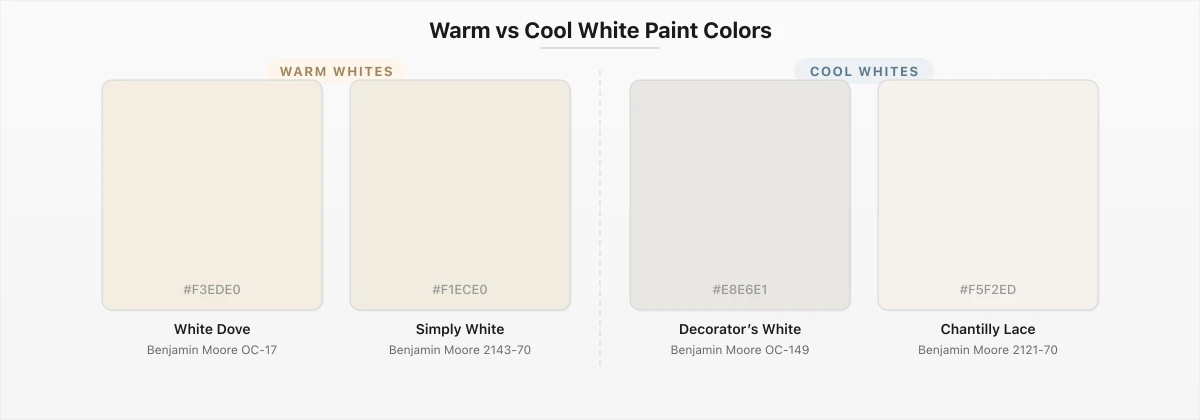
White is the single most popular paint color in the world — and ironically, it's where undertones cause the most grief. There is no such thing as a “plain white” paint. Every white on the market carries an undertone, and on a large wall that undertone becomes the dominant visual characteristic. What looked like a clean white in the store can read as pink, yellow, green, or blue once it covers 200 square feet of drywall. Our analysis of over 800 white paint colors using CIEDE2000 color science confirms this: even whites with nearly identical lightness values can differ dramatically in undertone.
Pink undertones are common in warm whites. Colors like Benjamin Moore's Swiss Coffee carry a faint rosy warmth that feels soft and traditional. Yellow undertones are the hallmark of creamy whites — think of White Dove, which has a buttery quality that pairs beautifully with wood tones and earth-toned furnishings. Blue undertones appear in cool whites and make a space feel modern and clinical. Simply White(Benjamin Moore) is a popular choice that sits close to true white with just the faintest warm cast — it works in nearly any room because its undertone is so restrained. On the cooler side, Decorator's White(Benjamin Moore) carries a subtle blue-gray undertone that reads as bright and contemporary.
Green undertones in whites are the sneakiest — many off-whites that appear neutral under store fluorescents reveal a greenish cast in rooms with north-facing windows. This is why sampling whites on your actual walls is absolutely critical. Browse our white color family to compare hundreds of whites side by side, or read our best white paint colors guide for curated picks organized by undertone.
Undertones in Beige and Greige Paint
Beige has been a staple neutral for decades, but it's far from simple. The undertone of a beige paint determines whether your room feels like a sun-drenched Mediterranean villa or a dated 1990s builder-grade home. The three most common beige undertones are pink/peach, yellow, and green. Pink-undertone beiges feel rosy and pair well with cool-toned furniture. Yellow-undertone beiges feel warm and golden — they're the classic “builder beige” that dominated homes for years. Green-undertone beiges are the trickiest; they can look muddy or olive in the wrong light, but in warm south-facing rooms, they feel organic and earthy.
Then there's greige — the gray-beige hybrid that has dominated interior design for the past decade. Greige colors blend the warmth of beige with the sophistication of gray, but the undertone is what makes or breaks them. A greige with a strong purple undertone can look lavender in cool light. A greige with a green undertone might read as khaki. The most versatile greiges, like Accessible Beige(Sherwin-Williams), succeed because their undertones are so balanced that they shift gracefully with changing light rather than locking into a single unexpected hue.
When choosing beige or greige, always compare at least three options from the same brand's strip card. The darker shades on the card will reveal the undertone. You can also use our color search to filter by family and compare swatches digitally before heading to the store. Explore our beige color family for a comprehensive look at every beige available across major brands.
How to Fix It When Undertones Go Wrong
You painted the room, stepped back, and the color is wrong. Maybe your gray looks purple under the recessed LEDs, or your white is reading pink next to the oak floors. Before you panic and repaint, there are a few strategies that can save you time and money.
Option 1: Change the lighting. This is the cheapest fix. Swap your bulb color temperature — if a cool white (5000K) LED is making your warm gray look purple, try a soft white (2700K) bulb instead. Lighting has an enormous effect on perceived undertones, and sometimes a $5 bulb swap fixes what looks like a $500 repainting problem.
Option 2: Add complementary accents. If your wall color leans too cool, warm it up with throw pillows, curtains, rugs, and artwork in warm tones — terracotta, mustard, wood, and warm metallics like brass. If the color runs too warm, balance it with cool-toned textiles and silver or chrome hardware. The surrounding decor shifts the eye's perception of the wall color more than most people realize.
Option 3: Repaint with a cousin color. If lighting and accessories can't fix it, you likely need a different shade — but not a completely different color. Stay within the same color family and choose a shade with the opposite undertone. If your gray went too blue, move toward a greige with brown undertones. Use our room visualizer to preview the replacement color on your actual walls before buying another gallon. You can also use the palette generator to find colors that share the same family but have different undertone profiles — this makes it easy to find the right “cousin” shade on the first try.


