
Warm vs Cool Paint Colors: How to Choose
The warm-vs-cool distinction is the most practical concept in paint selection. A warm gray and a cool gray can look like completely different colors on the same wall under the same lighting — and mixing them across an open floor plan is the most common reason a home doesn't feel cohesive. Understanding the difference before you buy samples saves time and expensive repaints.
What Makes a Color Warm or Cool?
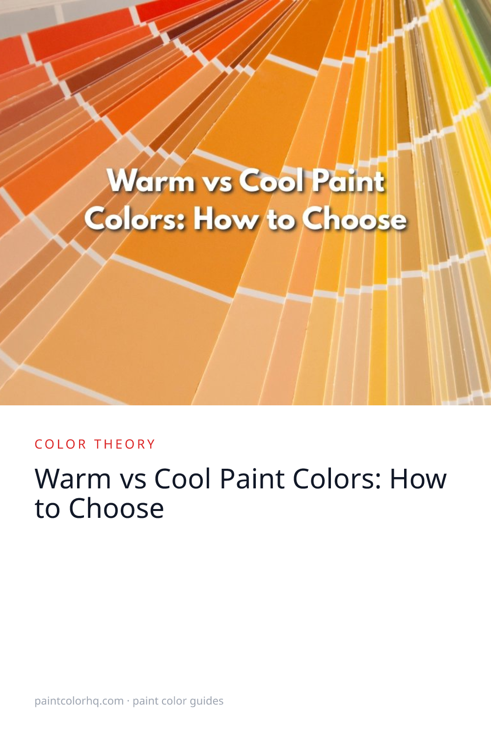
The color wheel is divided into two halves. Warm colors (reds, oranges, yellows and their derivatives) evoke sunlight, earth, and fire. Cool colors (blues, greens, purples) evoke water, sky, and shadow. But every color exists on a warm-to-cool spectrum, not just one side.
A warm gray like Edgecomb Gray(Benjamin Moore) (LRV 66) has yellow-brown undertones. A cool gray like Stonington Gray(Benjamin Moore) (LRV 60) has blue undertones. Both are “gray” on the chip, but they behave like different colors on a full wall under natural light.
How Lighting Shifts Temperature
North-facing rooms receive cool, blue-tinted light that amplifies cool undertones. Warm colors can help compensate. South-facing rooms receive warm, golden light that amplifies warm undertones. Cool colors balance nicely here.
East-facing rooms get warm morning light and cool afternoon light, so colors shift dramatically throughout the day. West-facing rooms get the reverse — cool mornings, warm golden-hour light in the evening.
Building a Cohesive Palette
The most important rule: stay in the same temperature family for connected spaces. If your living room is a warm greige, your adjoining kitchen should also use warm tones. Jumping from warm to cool across an open floor plan creates visual tension.
This doesn't mean every room must be the same color — just the same temperature. Shoji White(Sherwin-Williams) in the living room flows naturally into Accessible Beige(Sherwin-Williams) in the dining room because both are warm. Use our palette generator to build a cohesive warm or cool scheme, or visit our inspiration gallery for curated palette ideas.
Warm Colors for Your Home
Warm tones feel intimate and grounding. They suit bedrooms, dining rooms, and living spaces where you want people to settle in. For walls, Accessible Beige(Sherwin-Williams) (LRV 58) is one of the most reliable warm neutrals — it holds its warmth under both incandescent and natural light. Pair it with White Dove(Benjamin Moore) (LRV 86.2) on trim for a classic warm palette that works in virtually every lighting condition.
Cool Colors for Your Home
Cool tones feel open and focused. They suit bathrooms, home offices, and rooms with generous south-facing light where warmth is already built into the space. Quiet Moments(Benjamin Moore) (LRV 61.6) is a desaturated blue-green that reads as sophisticated and airy rather than cold. Pair it with Snowbound(Sherwin-Williams) (LRV 83) on trim to keep contrast without going stark white. Explore more in the blue and green color families.
When to Break the Rules
The warm/cool consistency rule applies to open, connected spaces where adjacent walls are visible from the same vantage point. Closed rooms with their own doors (powder rooms, bedrooms, home offices) operate independently and can be any temperature without affecting the rest of the home. A cool-toned powder room off a warm-toned hallway is perfectly fine because the transition happens behind a closed door. Use our compare tool to see how colors from different temperature families look next to each other.
Understanding warm vs. cool is especially important when choosing neutrals. Browse the gray color family and beige color family to see how undertones shift between warm and cool within the same color family. For a deeper look at how secondary pigments create these temperature differences, read our guide to paint color undertones.


