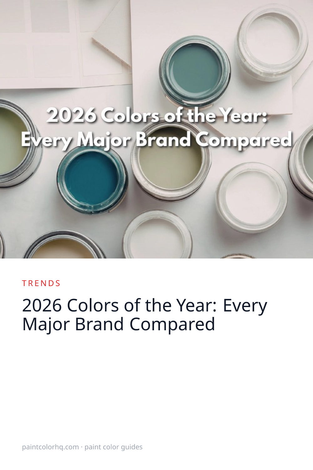

2026 Colors of the Year: Every Major Brand Compared
Every year, the biggest paint brands announce their Color of the Year — a single shade they believe captures the cultural mood. For 2026 the picks are strikingly aligned: earthy greens, warm neutrals, and nature-inspired tones dominate. After 2025's bolder palette of reds and deep navies, every major brand pivoted toward quieter, more livable colors. Below, every official 2026 selection — what it actually looks like on a wall, why each brand chose it, and what it pairs with.
Sherwin-Williams: Universal Khaki
Universal Khaki(Sherwin-Williams) is a warm, sandy neutral with golden undertones and an LRV of 40.6 — the brightest of the five 2026 picks. Sherwin-Williams positions it as a whole-house color that bridges beige and warm gray, which is why it landed as CoY: it's the safest bold pick on the list, designed to scale across rooms and lighting conditions without locking buyers into a single mood.
The choice makes more sense in context with 2025's Grounded (a deeper warm brown at LRV ~16). Universal Khaki softens that direction — keeps the earthy warmth, lightens the room. Signals that SW is reading the broader 2026 mood as “earthy livable” rather than the “earthy bold” that defined 2025. Pairs cleanly with warm wood floors, cream or off-white trim, and brass hardware. Avoid pure white trim — the contrast reads harsh and emphasizes any yellow shift in the khaki.
At LRV 40 it carries more visual weight than the chip suggests in north-facing rooms; sample on the actual wall before committing. Looking for this shade from another brand? Use our color search to find the closest Delta E match.
Benjamin Moore: Silhouette
Silhouette(Benjamin Moore) is a sophisticated dark gray-brown from the Affinity collection — BM's designer-leaning curated set. Benjamin Moore describes it as “burnt umber with delicate notes of charcoal,” with inspiration drawn from classic tailoring and fine suiting fabrics. LRV sits around 9-10, putting it firmly in accent-wall and architectural-trim territory rather than whole-room dominant. The undertone is the differentiator: warm enough to read brown-leaning under 2700K bulbs, neutral enough to read as a deep neutral under cool daylight.
Benjamin Moore tends to alternate moody anchors with brighter cheerful picks year-over-year. 2025's Cinnamon Slate tested chromatic depth with a heathered plum; Silhouette doubles down on the depth and strips out the chroma. This is the most architectural of the five 2026 picks — a color that signals BM is leaning hard into “cocooning spaces” (libraries, dining rooms, primary bedrooms) as a major 2026 design force.
Pairs with deep walnut floors, brass or matte black hardware, and warm whites for trim. At LRV 9, a pure white trim creates jarring contrast — use Simply White or White Dove to soften it. Browse all Benjamin Moore colors to find complementary shades for a full palette.
Behr: Hidden Gem
Hidden Gem(Behr) is a smoky jade green with LRV ~14, sitting in blue-green territory closer to teal than to sage. It's the boldest 2026 pick by a meaningful margin — Behr's recent CoY history zig-zagged between safe (Blank Canvas, an off-white) and confident (Cracked Pepper, near-black), and Hidden Gem returns firmly to the architectural lane.
The smoky-jade hue specifically is rare in mass-market paint lines — most greens are sage (warmer, lighter) or hunter (deeper, more saturated). Jade with this much blue depth reads as a designer choice rather than a builder-grade green. The most effective application is color-drenching: walls, trim, and ceiling all painted Hidden Gem so the green is the dominant note in the room. The green undertone specifically neutralizes the harsh cast of cool LED bulbs in a way that navy can't — making this an unconventionally smart laundry-room or mudroom pick where overhead lighting is bright and unforgiving.
Saturated greens shift more under different lighting than people expect — sample at multiple times of day. Pairs well with brass or aged-copper hardware, warm wood floors, and off-white trim (not pure white). Compare it against the full green color family to see how it stacks up against thousands of similar shades.
PPG: Warm Mahogany
Warm Mahogany(PPG) is a rich brown-red with LRV ~8 — the deepest, most saturated of all five 2026 picks. The color reads more like a furniture stain than a typical wall color, and that's likely the point. PPG's commercial-architectural lineage (Manor Hall, the spec-builder line) shows up in CoY picks that frame the brand as residential-designer-relevant rather than purely transactional.
At LRV 8 it absorbs most of the light in a room — pure white trim against it creates jarring contrast, and north-facing rooms make it read black. Most effective in small high-impact spaces: front doors, dining rooms, library accent walls, powder rooms, cabinetry. Pairs especially well with warm brass, natural walnut, leather, and cream-toned trim. Avoid pairing with cool grays or pure whites; the temperature mismatch makes the mahogany read clay-pot rather than rich.
The closest cross-brand equivalents sit in the warm-deep-brown range — browse the brown color family to find similar earth-toned shades across every brand.
Valspar: Warm Eucalyptus
Warm Eucalyptus(Valspar) is a gray-green with LRV ~20, sitting between sage and olive without fully committing to either. The “warm” suffix is the meaningful part: it leans yellow-green rather than blue-green, which keeps it from reading cold in north-facing rooms. Announced in August 2025 and available exclusively at Lowe's through Valspar's consumer line; the comparable independent-retailer color is Sage Slate V143-5.
Of the five 2026 picks, this is the most “livable” — usable as a whole-room color in most lighting, not just accent territory. Valspar typically picks crowd-friendly colors over designer statements, and Warm Eucalyptus fits that pattern. The closest counterpart on this list is Hidden Gem (also green, also LRV-low-teens), but where Hidden Gem reads architectural Warm Eucalyptus reads domestic. Pairs especially well with warm wood tones (oak, maple, walnut), natural stone, brass, and cream or off-white trim. Pure white trim would create too much contrast.
The Common Thread
The 2026 picks read as a coordinated industry pivot. Three of five are explicitly green-influenced (Hidden Gem, Warm Eucalyptus, Silhouette's earthy undertone). Five of five lean warm — there isn't a single cool gray or cool blue in the lineup. Five of five sit below LRV 45, requiring real sampling rather than chip-glance. Compare that with 2025's wider spread (Encore navy at LRV 6 next to Grounded brown at LRV 16 next to Rumors red at mid-saturation) and the cultural read is clear: the industry is softening the “bring color back” movement of the early 2020s into something quieter, earthier, and more genuinely livable.
The underlying signal isn't about specific colors — it's about lighting honesty. Each of the five picks performs meaningfully differently under 2700K warm bulbs versus 4000K daylight, and four of five carry enough chroma or saturation that lighting failures are visible at scale. That's a quiet reminder that the chip-on-the-wall step matters more in 2026 than in the gray-dominated decade prior. For a look back at last year's selections, see our 2025 Colors of the Year comparison.
Want to see how all these colors compare scientifically? Use our color compare tool to calculate the exact Delta E 2000 difference between any two shades. Preview any of these trending shades on your walls with our room visualizer. For the broader 2026 trend story beyond the official picks, see 2026 paint color trends.


