
The Best Blue Paint Colors for Every Room (2026)
The best blue paint color for most projects is Hale Navy(Benjamin Moore) (HC-154, LRV 8) — a deeply saturated transitional navy that works on cabinetry, accent walls, and front doors without committing to a single design style. But “best” depends on the room, the lighting, and how dark you can go. This guide ranks 14 designer-favorite blues across navy, mid-tone, and airy LRV ranges — each pick verified against our database with cross-brand matches so your painter's preferred deck is rarely a constraint.
How to Choose a Blue (Don't Skip This)
Three variables decide whether a blue works in your specific room: LRV, undertone, and natural light direction. Get any of these wrong and a beautiful chip becomes a wrong color on the wall.
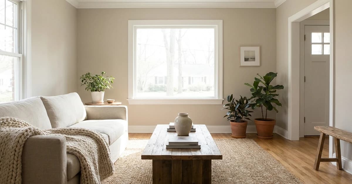
LRV (Light Reflectance Value). A blue with LRV under 15 will read almost black in low light and create a dramatic, enveloping room. LRV 15-40 is the “mid-blue” range — colors like teal and dusty blue that feel substantial but not heavy. LRV 40-65 is the airy mid-tone range, suitable for full-room walls in moderate light. Anything above LRV 65 is a pale wash — great for ceilings or rooms that need maximum brightness, but easy to read as gray on cloudy days.
Undertone. Pure blue is rare in residential paint. Most “blues” lean green (teal, ocean), purple (periwinkle, lavender-blue), or gray (steel, slate). Read our undertones guide for the full method, but the quick test: hold the chip against a piece of pure white printer paper. The contrast reveals which direction the color leans.
Light direction. North-facing rooms get cool, neutral light that intensifies any blue's coolness — blues read colder there. South-facing rooms get warm direct sun that softens blues and brings out any warm undertones. East-facing rooms shift dramatically across the day. West-facing rooms warm up in afternoon. Always sample before committing.
The 5 Best Navy Blues
Navy is the most reliable blue category — these LRV 5-15 colors read as “dark blue” without flashing purple or green in most lighting. Excellent for accent walls, kitchen islands, cabinetry, front doors, and dining rooms where you want atmosphere.
Hale Navy(Benjamin Moore) — HC-154, LRV 8. The most-specified navy among designers. Slightly green-leaning undertone makes it warmer than pure navy, which is why it pairs equally with warm wood floors and cool gray cabinetry. Closest Sherwin-Williams equivalent is Naval (SW 6244) within Delta E 2.1.
Naval(Sherwin-Williams) — SW 6244, LRV 7. Sherwin-Williams' signature deep navy. Slightly more saturated and slightly cooler than Hale Navy. The right pick when you want a navy that reads unambiguously navy — no question whether it's “a dark color” or “a navy.” Excellent on kitchen islands and shutters.
Newburyport Blue(Benjamin Moore) — HC-155, LRV 6. Darker and more traditional than Hale Navy. The Historic Colors collection palette places this firmly in the “heritage” category — front doors on colonial homes, libraries with built-ins, dining rooms with deep crown molding. Pairs especially well with brass hardware and oil-rubbed bronze.
Indigo Batik(Sherwin-Williams) — SW 7602, LRV 11. A softer, slightly grayer take on navy. Reads more “dusty denim” than “naval uniform.” The right pick for primary bedrooms when you want depth without going to a hard navy. Excellent paired with white linen bedding and natural wood headboards.
Stiffkey Blue(Farrow & Ball) — No. 281, LRV 5. The most dramatic blue on this list. Reads almost black in low light but reveals deep blue undertones when sunlight hits. The premium option for color-drenched rooms — paint walls, trim, and ceiling all in Stiffkey for the full Farrow & Ball effect. At $115/gallon it's an investment; the closest SW equivalent drops the cost ~50% with minimal visual difference on walls.
The 5 Best Mid-Tone Blues
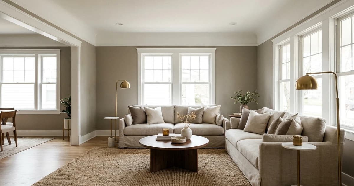
LRV 40-65. These work as full-room wall colors in moderate-to-bright light and pair well with white trim and natural wood floors. Designer-favorite category for primary bedrooms, home offices, and dining rooms that don't want navy commitment.
Sleepy Blue(Sherwin-Williams) — SW 6225, LRV 55. A soft mid-blue with green-gray undertones that prevent it from reading babyish. Works in any direction of natural light. The default mid-blue for bedrooms — bright enough to feel awake, soft enough to feel restful. Pairs naturally with white trim and warm hardwood floors. Browse more blue paint colors for the full palette.
Quiet Moments(Benjamin Moore) — 1563, LRV 54. A soft blue-gray with just enough blue to commit to the category. Reads serene rather than chilly. The exact mid-point between “blue” and “gray” — if you can't decide which family fits your room, this is the answer. Closest Behr equivalent is Composed (HDC-AC-23) within Delta E 1.8.
Rainwashed(Sherwin-Williams) — SW 6211, LRV 56. A subtle blue-green that reads more “coastal” than the others on this list. Strong green undertone makes it work with sage cabinetry and natural fiber rugs. Excellent for bathrooms and bedrooms in coastal-inspired or organic-modern interiors.
Smoky Azurite(Sherwin-Williams) — SW 9148, LRV 30. A deeper mid-blue with smoky gray undertones. Sits between mid-blue and navy — useful when you want depth but the room can't handle full navy. Reads especially well in north-facing rooms where cooler light intensifies its smokier qualities.
Drizzle(Sherwin-Williams) — SW 6479, LRV 55. A clean mid-tone blue with balanced undertones — neither obviously green nor obviously gray. The most “just blue” pick on this list. Works as a safe-but-not-boring blue when a project needs the color without strong character.
The 4 Best Airy Light Blues
LRV 65+. These nearly-white blues are perfect for ceilings, small rooms that need maximum light, and spaces that should feel airy and breathable. They demand attention to undertone — at this LRV range, a faintly warm or cool blue can shift dramatically across the day.
Aleutian(Sherwin-Williams) — SW 6241, LRV 48. The bright end of the mid-blue category, almost airy. Reads soft and atmospheric in moderate light. Excellent for foyers, hallways, and rooms that connect to whites without harsh transition.
Iceberg(Benjamin Moore) — 2122-50, LRV 65. A pale icy blue. Best for north-facing bathrooms and powder rooms where you want a hint of color without committing to a deep blue. Pairs naturally with white subway tile, polished nickel, and bright white trim.
Soar(Sherwin-Williams) — SW 6799, LRV 70. Nearly white with a subtle blue cast. Reads as “white with a hint of blue” in most lighting. Ideal for primary bedrooms in south-facing homes, where warm sunlight balances the cool undertone.
Misty(Sherwin-Williams) — SW 6232, LRV 64. A pale blue-gray that reads more atmospheric than colorful. Works exceptionally well on ceilings — adds dimension without competing with wall colors.
Best Blue Paint by Room
Bedrooms. Aim for LRV 45-65 for primary bedrooms. Quiet Moments, Sleepy Blue, and Indigo Batik (slightly darker, more sophisticated) are top picks. For kids' rooms and nurseries, go higher LRV (Iceberg, Soar) to keep the room energizing without overstimulation. Read our calming bedroom paint colors guide for the full LRV-driven approach.
Kitchens (cabinets). Navy blues dominate. Hale Navy is the safe default for islands or lower cabinets, paired with white upper cabinets and brass or polished chrome hardware. For a more contemporary look, Naval (SW) provides slightly more saturation. Use Benjamin Moore Advance (waterborne alkyd) for cabinet durability — read our SW vs BM brand comparison for the cabinet paint specifics.
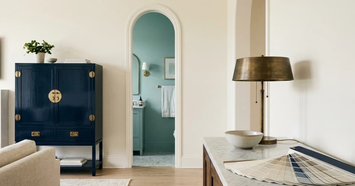
Bathrooms. Mid-tone blues (Quiet Moments, Sleepy Blue) work for primary bathrooms with good natural light. For powder rooms, go bolder — Stiffkey Blue or Hale Navy create the “jewel box” effect on a small footprint. For coastal/beachy bathrooms, Rainwashed (SW 6211) with its green-blue undertone is the go-to.
Exteriors. Hale Navy and Naval are the dominant exterior navies for shutters, doors, and accent siding. For full-house blue siding, look at deeper navies that hold their color over years of UV exposure — Newburyport Blue and Naval both have strong UV stability. Read our best exterior paint colors guide for sheen and durability requirements.
Front doors. Stiffkey Blue, Hale Navy, and Newburyport Blue are the classic front-door blues. The right one depends on your siding color: navy doors work with white, off-white, gray, and natural wood siding; they fight red brick.
Common Mistakes With Blue Paint
Choosing in store lighting. Paint stores use 5000K-6500K fluorescent bulbs designed to neutralize undertones. Your home almost certainly uses 2700K-3000K LED bulbs. A blue that looks balanced in the store can read significantly warmer or cooler at home. Always view a chip in your actual room before buying samples.
Ignoring the green-blue/purple-blue split. Most blue mistakes come from picking a blue with the wrong undertone for the room's existing materials. Green-leaning blues (Hale Navy, Rainwashed) work with warm wood floors and natural fiber rugs. Purple-leaning blues (Symphony Blue, some royals) work with cool gray cabinets and chrome fixtures. Mixing the two creates a visual clash.
Going too dark in a small dark room. Stiffkey Blue is gorgeous in a windowed dining room with afternoon sun. The same color in a windowless powder room reads cave-like. Always sample LRV-below-15 blues in the actual room before committing — and never pick a navy from a chip alone.
Skipping the cross-brand check. If your contractor stocks Behr and your designer specified Hale Navy, the close Benjamin Moore to Behr conversion equivalent at $50-60/gallon (vs Hale Navy at $80+) is often the better project value. Read our cross-brand matching guide for the Delta E methodology.
How to Find a Blue Match Across Brands
Every color on Paint Color HQ shows cross-brand matches ranked by Delta E score. Click any of the colors above and scroll to the cross-brand matches section — you'll see the closest equivalents from all 13 brands ranked by perceptual color difference. Delta E under 2.0 means the colors are virtually indistinguishable on a finished wall.
For systematic brand-to-brand conversions, see the SW to BM, BM to Behr, and SW to Behr conversion charts — each shows the 50 closest cross-brand pairs across all color families.
To preview any of these blues in your specific room before committing to samples, use our room visualizer. To build a complete palette around a blue (walls, trim, accent, pop), try the palette generator with any of the blues above as the base color.