
2025 Colors of the Year: Every Major Brand Compared
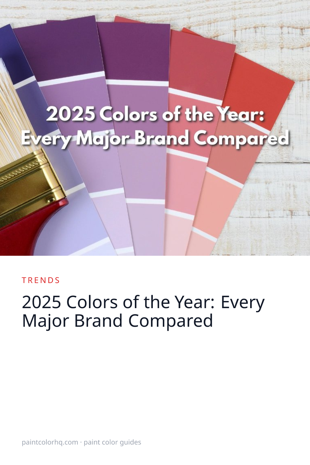
Every year, the biggest paint brands announce their Color of the Year — a single shade they believe captures the cultural mood. For 2025 the picks pivoted hard into warm earth tones and rich grounded hues, with four of five selections sitting in the brown / plum / red range. The era of cool grays as the default residential neutral effectively ended this year. Below is every official 2025 selection, why each brand chose it, and the practical caveats that don't show up in the press release.
Sherwin-Williams: Grounded
Grounded(Sherwin-Williams) is a warm, earthy brown with LRV ~16 — Sherwin-Williams' first true brown CoY in years. SW restructured their 2025 announcement into a nine-color Color Capsule rather than a single pick, with Grounded as the lead. The shift away from the light blue-green palette of recent picks (Renaissance, Quietude, Aleutian) toward deeper earth tones was deliberate — the cultural read at the time was “post-pandemic warmth,” colors that anchor and ground rather than brighten and energize.
Grounded reads most clearly as an accent or architectural color rather than a whole-room neutral. At LRV 16, it absorbs light quickly in north-facing rooms and can read muddy under cool LED bulbs. Most effective applications: front doors, kitchen islands, cabinetry, exterior trim, accent walls in libraries or dining rooms. Pairs especially well with warm wood floors, brass hardware, leather, and terracotta or cream-toned trim. Avoid pairing with cool grays or pure white trim — the temperature mismatch flattens the warmth that makes Grounded work.
Looking for this shade from another brand? Use our color search to find the closest Delta E match. Explore the full brown color family for more warm earth tones like Grounded.
Benjamin Moore: Cinnamon Slate
Cinnamon Slate(Benjamin Moore) is a delicate mix of heathered plum and velvety brown — landing in a chromatic space between chocolate and plum that's genuinely uncommon in mass-market paint lines. Most browns lean either yellow-warm (taupe, beige territory) or red-warm (mahogany territory). Cinnamon Slate splits the difference with a hint of violet, which is what gives it the “heathered” quality.
Benjamin Moore's CoY history alternates between architectural anchors and brighter cheerful picks. Cinnamon Slate marked a test of whether the market was ready for chromatic depth beyond just “warm earth.” Photograph it under controlled lighting and it reads plum; under 2700K warm bulbs at home it reads closer to a warm brown with a violet shadow. That bifurcation makes physical sampling essential — chip-glance and online preview both mislead.
Best applications: accent walls, cabinetry, exterior front doors, primary bedrooms. Pairs with cream or warm whites, walnut floors, soft brass or aged-bronze hardware. Browse all Benjamin Moore colors to find complementary shades for a full palette.
Behr: Rumors
Rumors(Behr) is a dynamic ruby red — warm, slightly muted, alluring rather than aggressive. Behr's pick was the most extroverted of the 2025 lineup: red is the most-debated paint color category, and Behr's announcement included survey data showing 76% of Americans would consider painting a room red (n=1,000, July 2024). Rumors specifically is calibrated to deliver drama without going clown-bright.
The strategic read: Behr leans toward crowd-friendly picks that move retail volume at Home Depot. Rumors plays to the “maybe I'll be brave this year” impulse without committing buyers to a screaming primary red. The execution gotcha is that reds intensify dramatically under 2700K warm bulbs (the standard residential bulb temperature) and can shift toward pink or wash out under 4000K cool daylight. Sample at multiple times of day in the room where it'll actually live.
Best applications: dining rooms, libraries, accent walls, kitchen cabinetry, front doors. Pairs with warm whites (avoid pure white — too clinical), dark wood floors, brass hardware. Compare it against the full red color family to see how it stacks up against thousands of similar shades.
PPG: Purple Basil
Purple Basil(PPG) is a deep, moody purple-brown that sits between plum and chocolate. PPG often picks colors that read like architectural detail rather than typical interior wall colors — Purple Basil fits that pattern. The hue is unusually chromatic for a 2025 CoY (most picks leaned safer brown or red); the purple bias signals PPG positioning toward designer specifications and architectural finish work rather than pure retail.
Like all purples, Purple Basil is the most lighting-sensitive pick of the five. Under 2700K warm bulbs the violet undertone reads as a deep mauve-plum; under 4000K daylight it leans closer to a true cool purple-brown. Photograph it and you'll see different colors at different exposures — another reason on-wall sampling matters more than chip-glance.
Best applications: accent walls, front doors, cabinetry, powder rooms. Pairs with warm woods (walnut, oak), brass hardware, cream trim, and natural stone. Avoid pairing with cool grays — the purple undertone amplifies any gray cast nearby.
Valspar: Encore
Encore(Valspar) is a deep saturated navy at LRV ~6 — one of the boldest Color of the Year picks in recent memory across any brand. Valspar bet on the “navy is the new black” trend that built through the early 2020s and chose the deepest, most architectural version of it.
Encore was the outlier of the 2025 lineup — the only deep-cool pick in a warm-earth-dominated year. The strategic read: Valspar testing whether the warm-earth signal extended to deep blue, or whether the “dark cocooning spaces” signal was strong enough on its own. At LRV 6 it eats light: pure white trim creates harsh contrast and the color reads near-black in any north-facing room. Specialty primer matters at this depth — most standard primers add an extra coat to coverage compared with mid-LRV colors.
Best applications: accent walls in well-lit rooms, front doors, cabinetry, dining rooms, libraries. Pairs with crisp warm whites (Simply White, White Dove), brass, brushed nickel, or matte black hardware. See the blue color family for the full range of navy and blue options.
The Common Thread
The 2025 picks are remarkably unified on warmth and depth, with one strategic outlier. Four of five lean explicitly warm — Grounded (brown), Cinnamon Slate (plum-brown), Rumors (red), Purple Basil (purple-brown). All four sit in the LRV 14-22 range. The fifth, Encore navy, was Valspar testing whether the deep-cocooning-space signal could extend to cool tones. The shared message across all five: the era of cool grays as the default residential neutral is over, and the industry is willing to commit to chromatic depth — not just warmer neutrals.
The underlying execution constraint across the lineup: every 2025 pick rewards careful sampling. Grounded shifts toward muddy under cool LEDs. Cinnamon Slate's violet reads differently in photos versus on a real wall. Rumors intensifies under warm bulbs. Purple Basil is lighting-sensitive across the board. Encore eats light. The 2020s gray-default era let buyers chip-glance and commit; 2025 doesn't.
Want to see how all these colors compare scientifically? Use our color compare tool to calculate the exact Delta E 2000 difference between any two shades. Preview any of these trending shades on your walls with our room visualizer. For the 2026 picks, see our 2026 Colors of the Year comparison. For a broader look at which colors dominated 2025 beyond the official picks, see our most popular paint colors of 2025 roundup.


