Accent Wall Colors and What to Pair Them With
Explore colors in this guide
Open a color for its details and cross-brand alternatives. Read on for the context behind each choice.
Pick the wall that faces the entrance, then paint it a color that is a few shades darker than the other three. Sherwin-Williams, Benjamin Moore and Farrow & Ball all publish pairings of accent and base colors, and we measured the light reflectance value (LRV) gap in each one. Farrow & Ball's lighter pairings have a median gap of 28.2 LRV points, its dark ones run 46.4 to 59.7, and the Sherwin-Williams and Benjamin Moore pairings in this post run from 31.9 to 77.8 because most of them use a white wall.
Which wall to accent
Two of the three manufacturers answer this directly. Sherwin-Williams says: "the wall that comes into view opposite the main entrance to the room is often the most appropriate one to use as your feature wall." Benjamin Moore says: "When choosing an accent wall, select a wall with purpose" because "your eye will be drawn to it immediately," and to "avoid walls you'd like to hide or blend into the room." Farrow & Ball does not name a wall, but its colour expert, Patrick, gives a rule for the color, covered below.
Our recommendation combines the two: when the wall opposite the door also holds the bed, sofa or fireplace, it is the one to paint. Skip a wall broken up by several doors or windows, because the color has little solid surface to show on.
How far apart should accent and base be?
The manufacturers disagree a little. Sherwin-Williams suggests you "choose a color a few shades darker than the other walls." Farrow & Ball's Patrick says: "The best way to approach a feature wall is to avoid any really strong contrasts between the accent colour and the three adjacent walls," and adds: "Look for colours with the same undertone, which will help you achieve a more 'blended' look." Benjamin Moore points the other way for light rooms: "For rooms with lighter, softer colours, bring in depth with dark, bold accent colours."
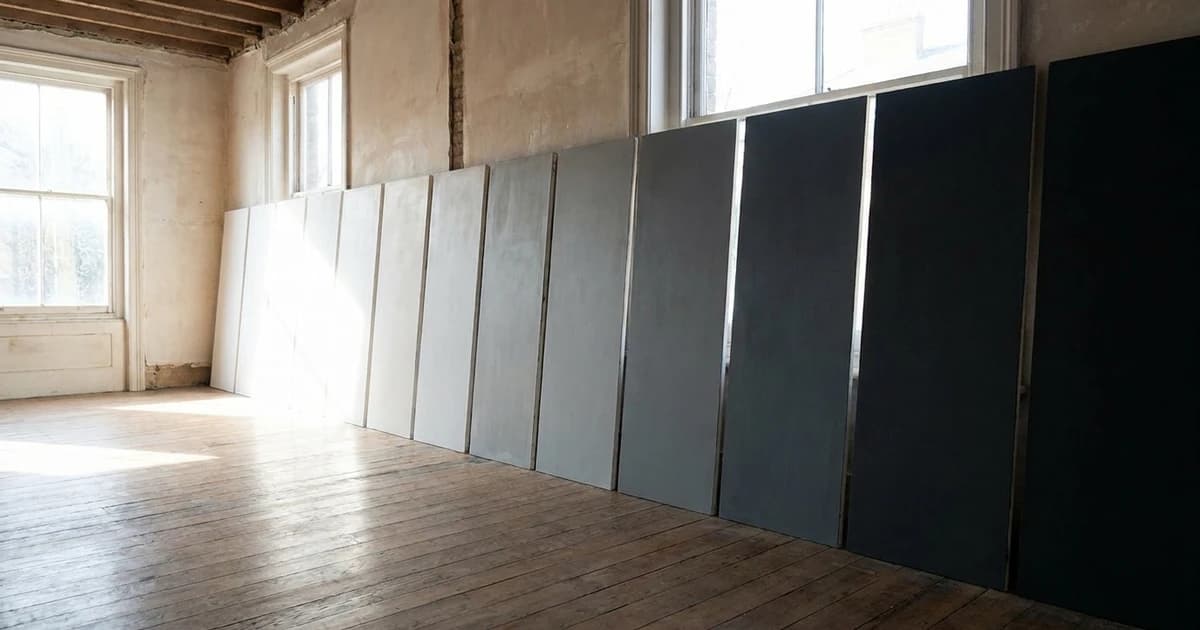
To turn that into a number, we pulled the LRV of every accent and wall in Farrow & Ball's published feature wall pairings from our database. LRV is the amount of light a color reflects on a scale of 0 to 100, where Sherwin-Williams says zero reflects no light and 100 reflects all light. The gap is the wall's LRV minus the accent's.
- In 15 of Farrow & Ball's lighter pairings (green, blue, gray and neutral groups), the gap runs from 13.7 to 45.5 points, with a median of 28.2. One pairing in its blue group, Titmouse Blue, is not in our database and is left out.
- In its four "dark" pairings, the gap runs from 46.4 to 59.7.
- In the ten Sherwin-Williams and Benjamin Moore pairings below, the gap runs from 31.9 to 77.8. Eight of the ten walls have an LRV of 70 or higher.
This is our reading of the manufacturers' own examples, not a rule they state. A gap near 30 points is the most common choice for a tonal look. A gap of 60 or more is a deliberate, dramatic one, and every example in this post at that size uses an accent with an LRV under 20 against a pale wall, which matches Benjamin Moore's advice to add depth to light, soft rooms with dark, bold accents.
Green accent wall colors
The Sherwin-Williams walls below are the coordinating colors in its own color data for each green. Browse the green family for more, and see our sage green guide for the lighter sages, which this post leaves out.
| Accent (LRV) | Other three walls (LRV) | LRV gap | Pairing from |
|---|---|---|---|
| Evergreen Fog(SW 9130) (30.4) | Neutral Ground(SW 7568) (70.6) | 40.2 | Sherwin-Williams |
| Evergreen Fog(SW 9130) (30.4) | Ethereal White(SW 6182) (75.7) | 45.3 | Sherwin-Williams |
| Pewter Green(SW 6208) (11.8) | Shoji White(SW 7042) (74.3) | 62.5 | Sherwin-Williams |
| Green Smoke(F&B 47) (19.2) | Shaded White(F&B 201) (64.7) | 45.5 | Farrow & Ball |
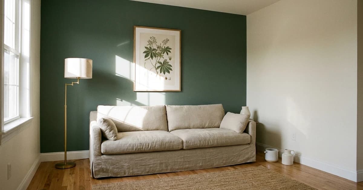
Sherwin-Williams describes Evergreen Fog as a "green-meets-gray with just a bit of blue." It is the lighter of the two accents. At LRV 30.4 it sits 40 points below its wall, so it reads as a clear step darker without turning the room dark. Pewter Green is the dramatic option: Sherwin-Williams describes it as "dark yet calming," and at LRV 11.8 against a wall at 74.3 the gap is 62.5 points.
Farrow & Ball's advice to match undertone can be tested with a measurement. CIELAB b* runs from negative (blue) to positive (yellow). Pewter Green measures b* 4.6 and Shoji White 6.7, so both lean slightly yellow and sit 2.1 apart. Evergreen Fog measures 6.6, against 8.8 for Neutral Ground and 4.5 for Ethereal White, so the accent sits between its two coordinating walls.
Blue accent wall colors
The three navies below are not interchangeable. The blue family page lists the rest.
| Accent (LRV) | Other three walls (LRV) | LRV gap | Pairing from |
|---|---|---|---|
| Naval(SW 6244) (4.5) | Icicle(SW 6238) (73.2) | 68.7 | Sherwin-Williams |
| Hale Navy(BM HC-154) (8.4) | White Dove(BM OC-17) (83.2) | 74.8 | Benjamin Moore |
| Hague Blue(F&B 30) (7.1) | Hardwick White(F&B 5) (43.0) | 35.9 | Farrow & Ball |
Sherwin-Williams says Naval has a "cool gray-green undertone," and we can put a number on its cool side: Naval measures b* -11.0, while its coordinating Icicle measures -1.0, close to neutral. Naval on Icicle is the highest-contrast blue pairing here at 68.7 points. Hague Blue on Hardwick White is the gentlest at 35.9, because Farrow & Ball's "white" is a mid-light color with an LRV of 43.0.
Comparing the navies themselves, Hale Navy and Hague Blue are very similar to each other. Naval is a visible difference from both. If you are swapping one for another, treat the result as a digital match and confirm it with a physical sample before buying a gallon. Benjamin Moore describes Hale Navy as "A use-anywhere shade of navy with a classic maritime feel."
Accent colors for gray walls
Gray bases give smaller gaps than white ones, 28.3 to 39.8 points here. Browse the gray family for more bases.
| Accent (LRV) | Gray walls (LRV) | LRV gap | Pairing from |
|---|---|---|---|
| Hale Navy(BM HC-154) (8.4) | Coventry Gray(BM HC-169) (48.2) | 39.8 | Benjamin Moore |
| Coral Rose(SW 9004) (28.2) | Agreeable Gray(SW 7029) (60.1) | 31.9 | Sherwin-Williams |
| Down Pipe(F&B 26) (13.0) | Blue Gray(F&B 91) (43.5) | 30.5 | Farrow & Ball |
| Plummett(F&B 272) (26.6) | Pavilion Gray(F&B 242) (54.9) | 28.3 | Farrow & Ball |
Coral Rose is the only warm-hued accent among the gray pairings. Sherwin-Williams lists it, along with Incredible White and Extra White, as coordinating colors for Agreeable Gray. Farrow & Ball also offers a gray-on-gray pairing with a smaller gap: Pavilion Gray on Dimpse, 13.7 points, the lowest of its pairings. Sherwin-Williams describes Agreeable Gray as having "a beige undertone."
Brown and rust accent wall colors
Brown family colors and the orange family, which holds the rust and terracotta shades, have more options. Two are worth pairing with their manufacturer's coordinating whites.
| Accent (LRV) | Other three walls (LRV) | LRV gap | Pairing from |
|---|---|---|---|
| Urbane Bronze(SW 7048) (8.1) | Shoji White(SW 7042) (74.3) | 66.2 | Sherwin-Williams |
| Urbane Bronze(SW 7048) (8.1) | Extra White(SW 7006) (85.9) | 77.8 | Sherwin-Williams |
| Cavern Clay(SW 7701) (19.9) | Creamy(SW 7012) (81.2) | 61.3 | Sherwin-Williams |
Sherwin-Williams calls Urbane Bronze a "brownish gray," and at LRV 8.1 it is a touch darker than Hale Navy. Its measured b* is 4.1 against 6.7 for Shoji White, so the pair lean the same way and sit 2.6 apart. Cavern Clay is the opposite case: Sherwin-Williams calls it a "reddish orange midtone," and it measures b* 24.3 against 7.2 for Creamy. The accent carries far more yellow than the wall, so this is a warm contrast where the bronze pairing is a nearly neutral one.
Bedroom accent walls
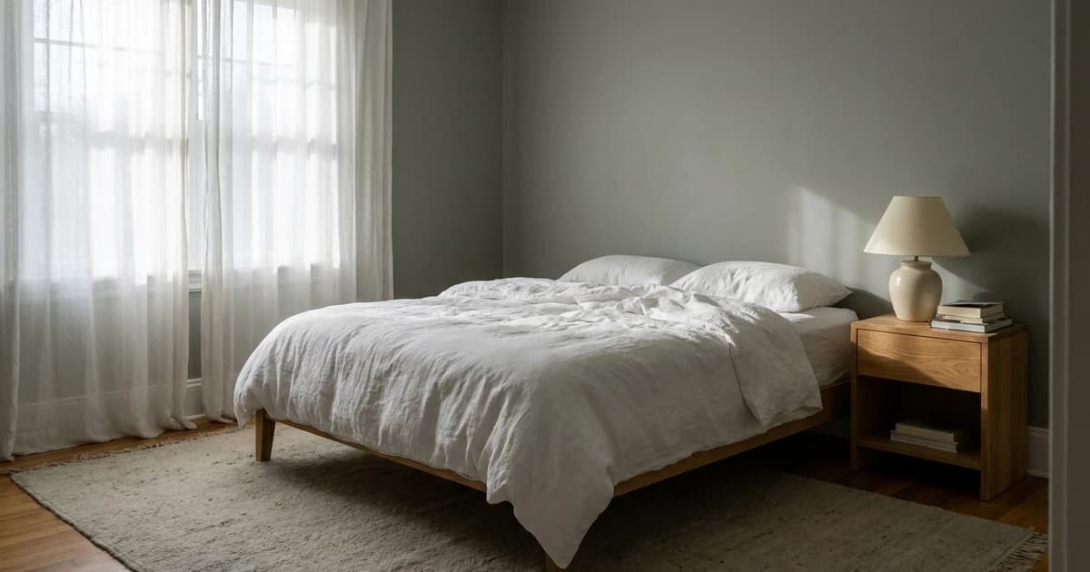
Sherwin-Williams names the bedroom for one of these colors: "Consider this gorgeous green-meets-gray with just a bit of blue in a bedroom" (Evergreen Fog). For the wall, our recommendation is the one behind the bed in most layouts, since that is the wall with a purpose in Benjamin Moore's terms. A mid-LRV accent like Evergreen Fog at 30.4 or Cavern Clay at 19.9 leaves more reflected light in a bedroom than Naval at 4.5. For more restful options see our calming bedroom paint colors.
The same accents in other brands
If you want one of these accents in a brand you already use, the closest matches in our database are below. These are digital matches. Confirm any substitute with a physical sample before you buy.
| Accent | Closest Behr | Closest other brand |
|---|---|---|
| Evergreen Fog | Shady Willow (nearly identical) | Storm Cloud Gray, Benjamin Moore (nearly identical) |
| Pewter Green | Painted Turtle (nearly identical) | Quaking Bog, Valspar (nearly identical) |
| Naval | Midnight Dream (very similar) | North Sea, Benjamin Moore (nearly identical) |
| Hale Navy | Dark Night (nearly identical) | Rogue Blue, Valspar (nearly identical) |
| Urbane Bronze | Black Bean (nearly identical) | Dragon's Breath, Benjamin Moore (nearly identical) |
| Cavern Clay | Mojave Sunset (nearly identical) | Audubon Russet, Benjamin Moore (nearly identical) |
To compare any two of these side by side, use the compare tool. Browse more from Sherwin-Williams, Benjamin Moore and Farrow & Ball.
Try the pairing before you buy
Preview each accent and base combination in the room visualizer, then build a full scheme with the palette generator. A screen cannot show how a wall changes through the day, so paint a large sample on the accent wall itself, using our sample testing guide. For the basics of how colors relate, see color theory for home decorators.
Frequently asked questions
- Which wall should be the accent wall?
- Sherwin-Williams says the wall that comes into view opposite the main entrance is often the most appropriate feature wall. Benjamin Moore advises selecting a wall with purpose, one your eye is drawn to immediately, and avoiding walls you would rather blend into the room.
- How dark should an accent wall be compared to the other walls?
- Sherwin-Williams suggests a color a few shades darker than the other walls. Farrow & Ball advises avoiding really strong contrasts between the accent and the three adjacent walls. In its own feature wall pairings, the gap in light reflectance value (LRV) between accent and wall has a median of 28.2 points for the lighter pairings and 46.4 to 59.7 points for its dark ones.
- What color wall goes with a navy accent wall?
- Benjamin Moore lists Coventry Gray, White Dove, Lenox Tan and Glacier White as color combinations for Hale Navy. Sherwin-Williams lists Icicle, Ramie and Roycroft Suede as coordinating colors for Naval. Farrow & Ball pairs Hague Blue with Hardwick White walls.
- What accent wall colors work with gray walls?
- Manufacturer pairings for gray walls include Hale Navy on Coventry Gray (Benjamin Moore), Coral Rose on Agreeable Gray (Sherwin-Williams), and Plummett on Pavilion Gray or Down Pipe on Blue Gray (Farrow & Ball). The LRV gap in those four pairs runs from 28.3 to 39.8 points.
- Is a brown accent wall too dark for a bedroom?
- Dark colors reflect little light, so the effect depends on the room. Urbane Bronze has an LRV of 8.1 and Evergreen Fog has an LRV of 30.4. Sherwin-Williams suggests Evergreen Fog for a bedroom, and a mid-LRV accent behind the bed leaves more light in the room than a very dark one.