Ref. #4C2F30 · MP4836
Obsidian
4%LRV Value
Warm (Pink)Undertone
Obsidian Technical Profile
What color is Obsidian? It's a dark warm red with the hex code #4C2F30. Colors similar to Obsidian include Sherwin-Williams Marooned, Behr Brown Eyes, Sherwin-Williams Rookwood Dark Red. Obsidian has a warm (pink) undertone, which affects how it pairs with trim, flooring, and adjacent wall colors. With an LRV of 4, Obsidian creates a dramatic, enveloping mood — best on accent walls, dining rooms, and intimate spaces where atmosphere matters more than reflected light. Pair it with creamy off-whites like Alabaster for trim, walnut or cherry hardwoods, and brass hardware — the warmth keeps reds from feeling clinical. Deep forest green or navy work as bold accent walls. Reds intensify under 2700K-3000K warm bulbs, deepening into wine territory. Under 4000K+ cool LEDs they can read pinker or slightly washed — sample under your actual room lighting before committing.
Colors Similar to Obsidian
Closest digital match based on color values. Always verify with physical samples.
Recommended Pairings
Colors That Work With Obsidian
Timeless pairing with clean white trim and a tonal accent wall
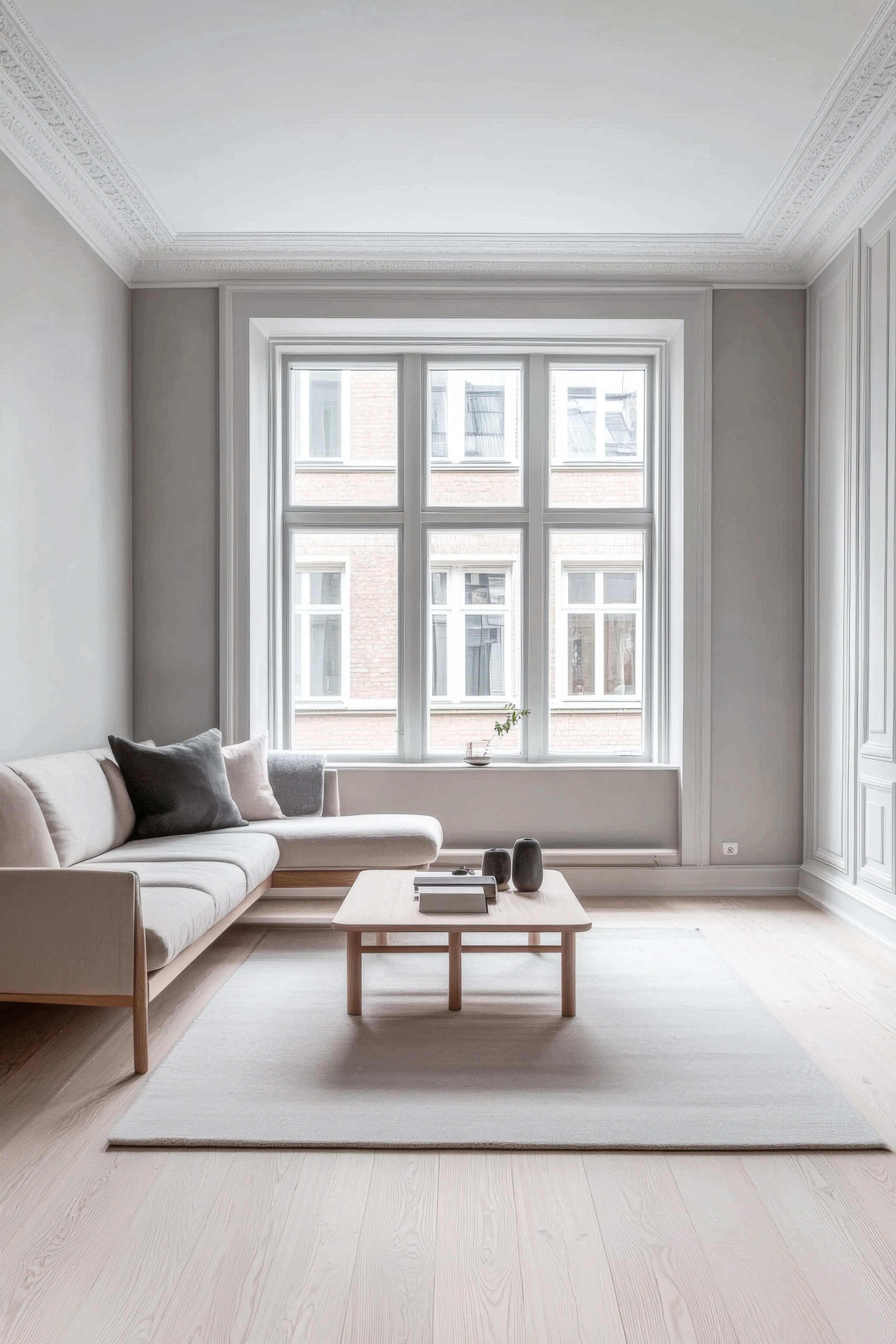
Side Walls
Obsidian
#4C2F30
Accent Wall
Tonal Shift
A warm shift that adds depth without clashing.
#685646
Trim & Molding
Pure White
Crisp white trim for a clean, traditional look.
#FFFFFF
Color Palettes for Obsidian
Color harmonies based on color theory — each swatch links to the closest matching paint.
Opposite on the color wheel — creates vibrant contrast
Obsidian Room Palettes
Color schemes built around this color — each swatch links to the closest matching paint.
Warm & Inviting
Warm tones with cozy appeal — welcoming and comfortable
Cool & Calm
Cool hues with soft contrast — serene and restful
Bold Contrast
Complementary hues with punch — dynamic and striking
Similar MPC Colors
Other MPC colors close to Obsidian.
More red colors from other brands
Cross-brand colors in the red family — useful when you want a similar look from a different brand.
Obsidian — Frequently Asked Questions
What undertone does Obsidian have?
Obsidian by MPC has a warm (pink) undertone and belongs to the red color family.
What colors match Obsidian from other brands?
The closest matches are Marooned by Sherwin-Williams (#4E3132), Brown Eyes by Behr (#543231), Rookwood Dark Red by Sherwin-Williams (#4B2929). Always verify with physical samples.
What is the LRV of Obsidian?
Obsidian has an LRV of 3.8, where 0 is pure black and 100 is pure white.
Explore More with Obsidian
Related Reading
How to Match Paint Colors Across Brands
The science behind Delta E and CIEDE2000 — find a Behr equivalent of any Sherwin-Williams shade, or a Benjamin Moore alternative when your store is out of stock.
Understanding Paint Color Undertones
Why Obsidian's warm (pink) undertone matters more than its surface color — and how to read undertones in any paint chip.