
Look at the Bright Side 0858 is a orange paint color from Vista Paint. It has a hex value of #FFBD00, estimated LRV 58 and a warm (golden) undertone. Its closest cross-brand match is Center Stage from Behr (nearly identical), with 49 more equivalents across other brands.
Vista Paint · #FFBD00 · 0858
Look at the Bright Side
58%Estimated LRV
Warm (Golden)Undertone
Look at the Bright Side Technical Profile
HEX Code#FFBD00
RGB255, 189, 0
Estimated LRV57.7
UndertoneWarm (Golden)
Digital swatches and calculated matches are approximations. Catalog LRV values may be calculated estimates, not manufacturer measurements. Data and matching method. Check the brand reference and physical samples before purchase.
Color Familyorange
BrandVista Paint
Test it in your room
Place physical samples beside your flooring and trim. Check them in daylight and with your evening lights before buying paint.
Use this color
Get this color
Some sample and supply links are affiliate links — if you buy through them, Paint Color HQ may earn a small commission at no extra cost to you. It helps keep the site free.
Compare alternatives to Look at the Bright Side
Digital candidates from other paint brands, ranked by color similarity. Always verify with a physical sample. How we calculate match accuracy →
Center Stage
Behr
#FEBD00
Close digital match
Yellow Flash
Benjamin Moore
#FFBE01
Close digital match
Look at the Bright Side
Hirshfield's
#FFBF00
Close digital match
Gold Abundance
Valspar
#FFBB08
Close digital match
Ducky Yellow
Dutch Boy
#FEBF01
Close digital match
Goldfinch
Sherwin-Williams
#FDB702
Close digital match
Yellow Summer
Dunn-Edwards
#F9B500
Similar digital color
Fall Gold
PPG
#FFBC35
Similar digital color
Aspire .06
Colorhouse
#FFBA38
Similar digital color
Extrovert
Kilz
#FECA43
Similar digital color
Melon Yellow
RAL
#F4A900
Visible digital difference
Babouche
Farrow & Ball
#ECC363
Visible digital difference
Comparing these brands? Order peel-and-stick samples of your top matches — Samplize buy 8 peel-and-stick samples, get 2 free.
Generated palette previews
Colors That Work With Look at the Bright Side
These are generated digital colors, not named manufacturer paints. Use the palette tools to find paint candidates, then compare physical samples.
Timeless pairing with clean white trim and a tonal accent wall
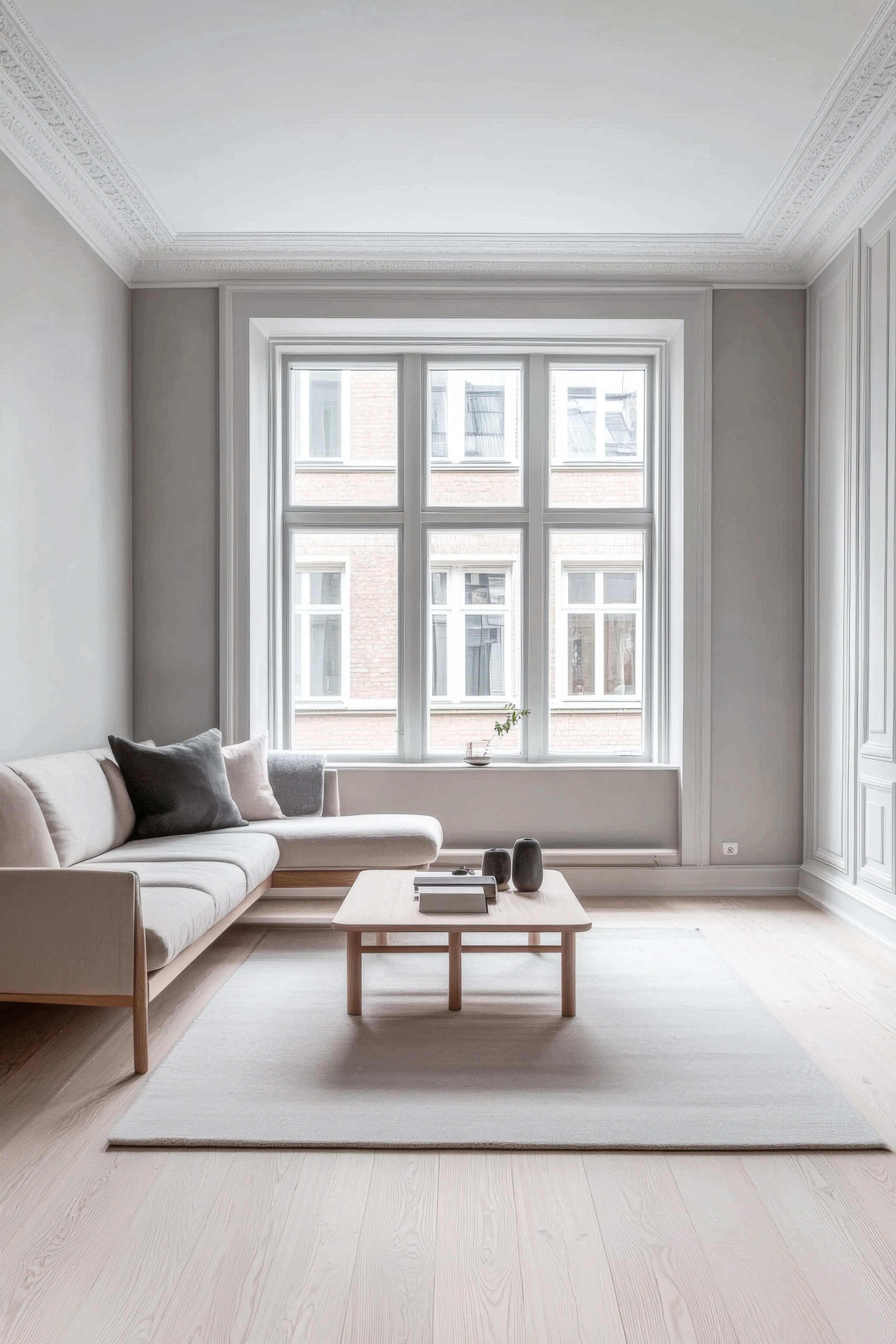
Side Walls
Look at the Bright Side
#FFBD00
Accent Wall
Tonal Shift
A warm shift that adds depth without clashing.
#B9D65C
Trim & Molding
Digital white
Crisp white trim for a clean, traditional look.
#FFFFFF
Color Palettes for Look at the Bright Side
Color harmonies based on color theory — each swatch links to the closest matching paint.
Opposite on the color wheel — creates vibrant contrast
Look at the Bright Side Room Palettes
Color schemes built around this color — each swatch links to the closest matching paint.
Warm & Inviting
Warm tones with cozy appeal — welcoming and comfortable
Cool & Calm
Cool hues with soft contrast — serene and restful
Bold Contrast
Complementary hues with punch — dynamic and striking
Similar Vista Paint Colors
Other Vista Paint colors close to Look at the Bright Side.
More orange colors from other brands
Cross-brand colors in the orange family — useful when you want a similar look from a different brand.
Look at the Bright Side — Frequently Asked Questions
What undertone does Look at the Bright Side have?
Look at the Bright Side by Vista Paint has a warm (golden) undertone and sits in the orange color family. This is a digital classification, not a prediction of physical paint under every light. Compare samples in your own space.
What colors match Look at the Bright Side from other brands?
The closest cross-brand equivalents to Look at the Bright Side are Center Stage by Behr (a close digital match), Yellow Flash by Benjamin Moore (a close digital match), Look at the Bright Side by Hirshfield's (a close digital match) — the best options for getting Look at the Bright Side's look from a brand your local store carries. Confirm with a physical sample, since sheen and lighting shift the final result.
What is the LRV of Look at the Bright Side?
Look at the Bright Side has a estimated lightness value of 57.7, on a scale where 0 is pure black and 100 is pure white — that makes it a mid-light color — bright enough for living areas yet soft enough for bedrooms, and adaptable across most lighting conditions.
Explore More with Look at the Bright Side
Related Reading
How to Match Paint Colors Across Brands
The science behind Delta E and CIEDE2000 — find a Behr equivalent of any Sherwin-Williams shade, or a Benjamin Moore alternative when your store is out of stock.
Understanding Paint Color Undertones
Why Look at the Bright Side's warm (golden) undertone matters more than its surface color — and how to read undertones in any paint chip.