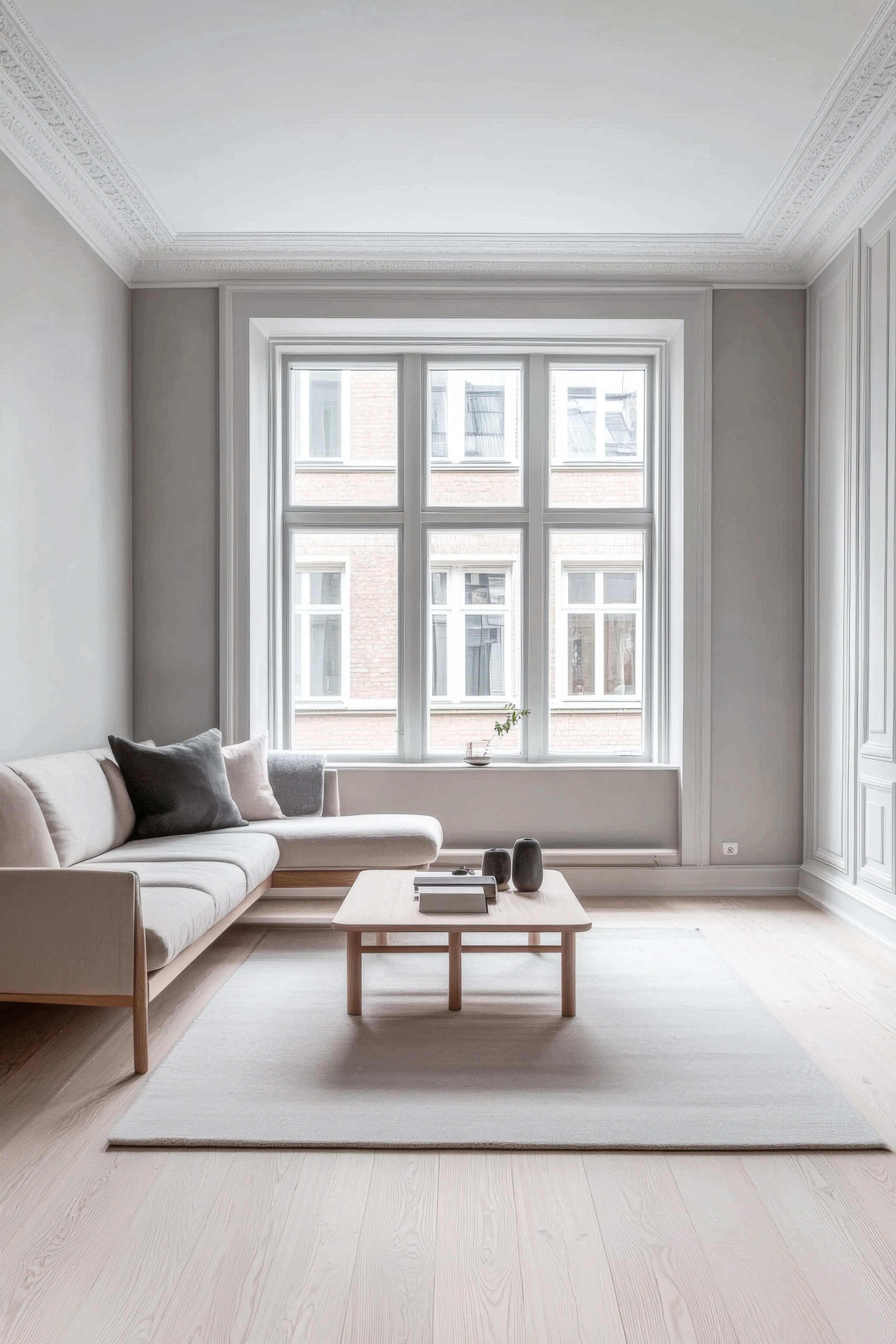
Pretty Things works as a confident anchor color — best in rooms that can carry visual weight (dining rooms, libraries, accent walls) rather than as a whole-room palette. At LRV 36 it carries real depth without going dark — a good choice for accent walls, libraries, and rooms with abundant natural light. Because it's a fully saturated example, it lands strongest as a single accent wall or large architectural feature rather than the dominant whole-room color. Skip it where you want a calm, restful feel — red raises visual energy, so it fights bedrooms and small home offices.
Ref. #DB8E76 · 207-4DB
Pretty Things
36%LRV Value
Pretty Things Technical Profile
What color is Dutch Boy Pretty Things (207-4DB)? It's a medium warm red — hex #DB8E76, LRV 36. The closest cross-brand equivalent to Pretty Things is Behr Candied Yams (m210-5) — a near-identical match on the wall, with Kilz Antigua Sunset and Valspar Sweetly Singing also close. Its LRV of 36 gives Pretty Things depth without going dark, which makes it a strong choice for accent walls, libraries, and rooms with abundant natural light. Pair it with creamy off-whites like Alabaster for trim, walnut or cherry hardwoods, and brass hardware — the warmth keeps reds from feeling clinical. Deep forest green or navy work as bold accent walls. As a fully saturated example, it reads as a confident statement color — best deployed as a single accent wall or large architectural feature rather than a whole-room dominant. Reds intensify under 2700K-3000K warm bulbs, deepening into wine territory. Under 4000K+ cool LEDs they can read pinker or slightly washed — sample under your actual room lighting before committing. Saturated colors amplify lighting effects more than muted ones: warm bulbs deepen and enrich, cool daylight sharpens and slightly cools the same hex.
Use this color
Get this color
Some sample and supply links are affiliate links — if you buy through them, Paint Color HQ may earn a small commission at no extra cost to you. It helps keep the site free.
Colors Similar to Pretty Things
Closest digital match based on color values. Always verify with physical samples.
Recommended Pairings
Colors That Work With Pretty Things
Timeless pairing with clean white trim and a tonal accent wall
Side Walls
Pretty Things
#DB8E76
Accent Wall
Tonal Shift
A warm shift that adds depth without clashing.
#BDAA75
Trim & Molding
Pure White
Crisp white trim for a clean, traditional look.
#FFFFFF
Color Palettes for Pretty Things
Color harmonies based on color theory — each swatch links to the closest matching paint.
Opposite on the color wheel — creates vibrant contrast
Pretty Things Room Palettes
Color schemes built around this color — each swatch links to the closest matching paint.
Warm & Inviting
Warm tones with cozy appeal — welcoming and comfortable
Cool & Calm
Cool hues with soft contrast — serene and restful
Bold Contrast
Complementary hues with punch — dynamic and striking
Similar Dutch Boy Colors
Other Dutch Boy colors close to Pretty Things.
More red colors from other brands
Cross-brand colors in the red family — useful when you want a similar look from a different brand.
Pretty Things — Frequently Asked Questions
What colors match Pretty Things from other brands?
The closest cross-brand equivalents to Pretty Things are Candied Yams (m210-5) by Behr (a near-identical match), Antigua Sunset by Kilz (a near-identical match), Sweetly Singing by Valspar (a near-identical match). These are ranked with the CIEDE2000 color-difference formula, which scores how similar two colors actually look to the eye rather than matching them by name — so they're the best options for getting Pretty Things's look in a brand your local store carries. Always confirm with a physical sample, since sheen and lighting shift the final result.
What is the LRV of Pretty Things?
Pretty Things has a Light Reflectance Value (LRV) of 35.7, on a scale where 0 is pure black and 100 is pure white. That makes it a mid-depth color with real presence — strong on accent walls, libraries, and rooms with good natural light. LRV is the most reliable guide to how light or dark a paint will read in a real room — more dependable than the swatch on your screen, which varies by monitor.
Explore More with Pretty Things
Related Reading
How to Match Paint Colors Across Brands
The science behind Delta E and CIEDE2000 — find a Behr equivalent of any Sherwin-Williams shade, or a Benjamin Moore alternative when your store is out of stock.
Paint Sheen Guide
Flat, eggshell, satin, or semi-gloss — the right finish for Pretty Things depends on the room. Here's how to choose.