
Contessa’s Cape 8285 is a gray paint color from Vista Paint. It has a hex value of #4C4E4C, estimated LRV 8 and a neutral undertone. Its closest cross-brand match is Muted Ebony from Valspar (nearly identical), with very similar options from 12 other brands.
Vista Paint · #4C4E4C · 8285
Contessa’s Cape
8%Estimated LRV
NeutralUndertone
Contessa’s Cape Technical Profile
HEX Code#4C4E4C
RGB76, 78, 76
Estimated LRV7.5
UndertoneNeutral
Digital swatches and calculated matches are approximations. Catalog LRV values may be calculated estimates, not manufacturer measurements. Data and matching method. Check the brand reference and physical samples before purchase.
Color Familygray
BrandVista Paint
Test it in your room
Place physical samples beside your flooring and trim. Check them in daylight and with your evening lights before buying paint.
Use this color
Get this color
Amazon and ECOS Paints links are affiliate links. As an Amazon Associate, Paint Color HQ earns from qualifying purchases, and it earns a commission from ECOS through Awin, at no extra cost to you. Other sample and store links are not affiliate links. ECOS matches from its library of other brands' color samples, and those can vary slightly, so mail ECOS a sample if you need a specific color. The smallest match it makes is a quart.
Compare alternatives to Contessa’s Cape
Digital candidates from other paint brands, ranked by color similarity. Always verify with a physical sample. How we calculate match accuracy → Matching a different color? Start a new paint color match.
Muted Ebony
Valspar
Nearly identical
Nightfall
Benjamin Moore
Nearly identical
Toasted Poppyseed
Kilz
Nearly identical
Space Black
Behr
Nearly identical
Rock Bottom
Sherwin-Williams
Nearly identical
Blackjack
Dunn-Edwards
Nearly identical
Umbra Grey
RAL
Very similar
Studio Green
Farrow & Ball
Very similar
Brattle Spruce
Hirshfield's
Very similar
Metal .05
Colorhouse
Very similar
Licorice
PPG
Very similar
Dark and Stormy
Dutch Boy
Very similar
Comparing these brands? Order peel-and-stick samples of your top matches. Samplize ships 10 or more samples free overnight.
Generated palette previews
Colors That Work With Contessa’s Cape
These are generated digital colors, not named manufacturer paints. Use the palette tools to find paint candidates, then compare physical samples.
Timeless pairing with clean white trim and a tonal accent wall
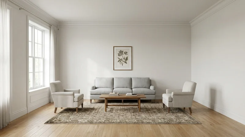
Main Walls
Contessa’s Cape
#4C4E4C
Accent Wall
Tonal Shift
A warm shift that adds depth without clashing.
#527B67
Trim & Molding
Digital white
Crisp white trim for a clean, traditional look.
#FFFFFF
Color Palettes for Contessa’s Cape
Color harmonies based on color theory — each swatch links to the closest matching paint.
Opposite on the color wheel: creates vibrant contrast
Contessa’s Cape Room Palettes
Color schemes built around this color — each swatch links to the closest matching paint.
Warm & Inviting
Warm tones with cozy appeal — welcoming and comfortable
Cool & Calm
Cool hues with soft contrast — serene and restful
Bold Contrast
Complementary hues with punch — dynamic and striking
Similar Vista Paint Colors
Other Vista Paint colors close to Contessa’s Cape.
More gray colors from other brands
Cross-brand colors in the gray family: useful when you want a similar look from a different brand.
Contessa’s Cape: Frequently Asked Questions
What undertone does Contessa’s Cape have?
Contessa’s Cape by Vista Paint has a neutral undertone and sits in the gray color family. This is a digital classification, not a prediction of physical paint under every light. Compare samples in your own space.
What colors match Contessa’s Cape from other brands?
The closest cross-brand matches to Contessa’s Cape are Muted Ebony by Valspar (nearly identical in our digital data), Nightfall by Benjamin Moore (nearly identical in our digital data), Toasted Poppyseed by Kilz (nearly identical in our digital data). These are the best options for getting Contessa’s Cape's look from a brand your local store carries. Confirm with a physical sample, since sheen and lighting shift the final result.
What is the LRV of Contessa’s Cape?
Contessa’s Cape has an estimated light reflectance value (LRV) of 7.5, on a scale where 0 is pure black and 100 is pure white. That makes it a deep, dramatic color best saved for accent walls, dining rooms, and cozy spaces where atmosphere matters more than reflected light.
Explore More with Contessa’s Cape
Related Reading
How to Match Paint Colors Across Brands
The science behind Delta E and CIEDE2000: find a Behr equivalent of any Sherwin-Williams shade, or a Benjamin Moore alternative when your store is out of stock.
Understanding Paint Color Undertones
How to read undertones in any paint chip, and why they matter more than the surface color.