
15 Best Dining Room Paint Colors for Every Style (2026)
The best dining room paint colors share one thing: they make the room feel intentional. Whether you want a moody navy that turns Tuesday pasta into a dinner party or a warm neutral that flows into an open kitchen, the right dining room color transforms how meals feel. These 15 colors cover every style — from dramatic jewel tones to trending 2026 earth tones — with specific brand names, hex codes, and pairing advice so you can choose with confidence.
Why Dining Rooms Can Handle Bold Color
Color psychology matters here: warm, saturated tones stimulate appetite and conversation. There's a reason the best restaurants avoid white walls. Dining rooms are also experienced in shorter bursts than bedrooms or offices, which means you can go darker and more dramatic without fatigue.
Evening lighting is the other factor. Dining rooms are primarily used under warm, low light — candles, dimmers, pendants — which makes rich colors glow rather than feel heavy. A color that seems intense under noon sunlight often looks perfect at 7 PM under a chandelier.
Rich Jewel Tones for Drama
Jewel tones create intimacy and a sense of occasion. If you entertain frequently or want your dining room to feel like a destination rather than a passthrough, these are the colors to consider.
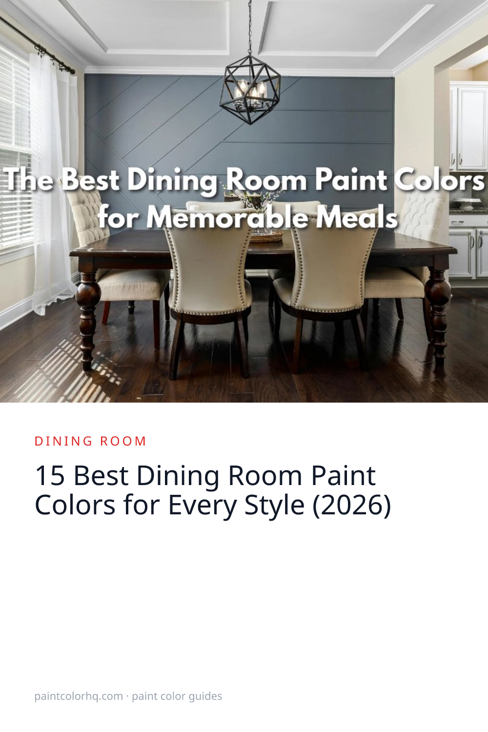
Naval(Sherwin-Williams) — navy is the single most popular bold dining room color in America. It conveys elegance, works with every wood tone from oak to walnut, and makes white trim and china pop. It looks equally stunning in traditional homes with wainscoting and in modern spaces with clean lines. Browse the blue color family for lighter navy alternatives.
Shadow(Benjamin Moore) — a moody, sophisticated plum-gray that's dramatic without being overwhelming. It looks stunning by candlelight and pairs with both gold and silver accents. Shadow works especially well in dining rooms with high ceilings where you want the walls to feel enveloping.
Essex Green(Benjamin Moore) — a deep forest green that creates a rich, library-like dining room. Pair with brass light fixtures and a wood table for old-world sophistication. Essex Green is one of Benjamin Moore's Historical Collection colors, which means it has been used in American homes for centuries. See more in the green color family.
Warm Mahogany(PPG) — a sumptuous red-brown with earthy undertones that PPG highlighted as a 2026 trend color. It brings warmth and depth to formal dining rooms without the intensity of a pure red. Pair with cream linens and natural wood for a grounded, inviting feel.
Warm Earth Tones (The 2026 Trend)
The biggest dining room color trend in 2026 is the shift from cool grays toward warm earth tones — taupes, terracottas, khakis, and mushroom shades. These colors feel organic, grounding, and naturally cozy under warm dining room lighting. Read our 2026 Color of the Year comparison for more on this shift.
Universal Khaki(Sherwin-Williams) — the 2026 HGTV Home by Sherwin-Williams Color Collection pick. A warm, sandy neutral that represents the definitive move away from cool grays. It works beautifully in dining rooms because it flatters skin tones under warm lighting and pairs with virtually any wood table or chair.
Wholesome(Sherwin-Williams) — a warm terracotta that brings Mediterranean warmth to any dining space. It glows beautifully under pendant lighting and pairs with white dishes, terracotta serveware, and linen table runners.
Shiitake(Sherwin-Williams) — a mushroom tone that's having a moment in dining rooms. It's warm, grounding, and sophisticated without being dark — the dining room equivalent of a cashmere sweater. Browse the brown color family for more earthy options.
Safari Beige(Valspar) — a sandy, warm beige-brown that creates an organic, earthy dining room. It pairs naturally with ceramic tableware, woven placemats, and natural wood tones. Explore all Valspar colors on our site.
Elegant Neutrals for Open Floor Plans
If your dining room is open to the kitchen or living room — as most modern floor plans are — you need a color that creates subtle distinction without a jarring change. Warm neutrals that are one or two shades deeper than your adjacent rooms define the dining space while maintaining flow.
Edgecomb Gray(Benjamin Moore) — a warm greige that's elegant enough for a formal dining room but casual enough for everyday use. It works as a standalone or as a complement to a bolder accent wall. Compare it against other greiges using our color compare tool.
Accessible Beige(Sherwin-Williams) — slightly warmer and richer than Agreeable Gray. It creates a cozy, golden atmosphere under warm lighting that makes dining rooms feel especially inviting on winter evenings. Browse the beige color family for similar tones.
Agreeable Gray(Sherwin-Williams) — America's most popular paint color works in dining rooms that need to blend seamlessly with adjacent spaces. It's the safe choice when you want warmth without committing to a specific color direction. See our living room color guide for complementary options.
Soft & Formal Dining Room Colors
For a dining room that feels refined and classic rather than dramatic, muted blues and greens offer timeless elegance. These work especially well in traditional homes, dining rooms with crown molding, and spaces with crystal chandeliers or silver accents.
Quiet Moments(Benjamin Moore) — a soft blue-green that adds color without intensity. It's serene and pairs perfectly with white wainscoting and crystal chandeliers. This is one of Benjamin Moore's most popular colors for formal dining rooms.
Pewter Green(Sherwin-Williams) — a muted sage-forest that feels both modern and traditional. It's one of the most versatile dining room greens available and looks particularly elegant with white trim and warm brass hardware.
How to Choose the Right Dining Room Color
Consider your dining style. If you host formal dinner parties, lean toward jewel tones or soft formal shades that create atmosphere. If your dining room is where kids eat cereal and you work on your laptop, a warm neutral or earth tone handles daily life better.
Match your room's exposure. North-facing dining rooms get cool, bluish light — choose warmer colors like Wholesome, Universal Khaki, or Accessible Beige to counteract it. South-facing rooms can handle cooler tones like Quiet Moments or Pewter Green without feeling cold. Read our north-facing rooms guide for more.
Coordinate with your table and chairs. Dark walls with a light table create contrast and drama. Dark walls with a dark table create a moody, enveloping cocoon. Both work — just be intentional about the effect you want.
Use our room visualizer to preview any of these colors in a dining room setting before buying samples. Then use the paint calculator to figure out exactly how many gallons you need.
The Accent Wall Approach
If painting an entire dining room in a bold color feels risky, try a single accent wall. The wall your eye hits first when entering the room is the best candidate. Paint it in a bold color like Naval or Essex Green and keep the remaining three walls in a complementary neutral like Edgecomb Gray or Accessible Beige. This gives you 80% of the drama with 20% of the commitment.
Use our palette generator to build a wall + trim + accent scheme that works together. If you want to see two specific colors side by side, the compare tool shows them at full scale.
Dining Room Paint Finish Guide
Walls: eggshell or satin. Dining room walls see splashes, fingerprints, and the occasional thrown pea. Eggshell cleans easily while still looking elegant. Satin offers slightly more sheen and durability if you have young children.
Trim and wainscoting: semi-gloss. Chair rail trim, wainscoting, and crown molding look best in semi-gloss. The contrast between a matte-ish wall and glossy trim adds depth and architectural interest to any dining room.
Test colors at night. Dining rooms are primarily used in evening light. Sample your color and observe it under your actual dining room lighting — pendant, chandelier, or candles. A color that looks perfect at noon may look completely different at 7 PM. Read our undertones guide for more on how lighting affects color.
Frequently Asked Questions
What is the most popular dining room paint color? Navy blue (like Sherwin-Williams Naval) and warm greige (like Edgecomb Gray) are consistently the two most popular dining room paint colors. Navy dominates in formal dining rooms while greige leads in open-concept homes.
What dining room colors are trending in 2026? Warm earth tones are the biggest 2026 dining room trend — sandy khakis, terracottas, and mushroom shades are replacing the cool grays of recent years. Deep, botanical greens and warm mahogany reds are also gaining popularity for statement dining rooms.
Should I paint my dining room a dark color? Yes, if you want drama and intimacy. Dining rooms are one of the best spaces for dark colors because they're used in short bursts under warm evening light. Dark colors like navy, forest green, and deep plum look better at night than they do on a daytime paint chip.
What color makes a small dining room look bigger? Light, warm neutrals like Edgecomb Gray or Accessible Beige open up small dining rooms. Painting the ceiling the same color as the walls — or one shade lighter — also creates the illusion of height. Use our color identifier tool to match your existing adjacent room colors and find a complementary dining room shade.
What paint finish is best for a dining room? Eggshell or satin for walls, semi-gloss for trim and wainscoting. Flat/matte finishes show every scuff and are hard to clean — avoid them in a room where food and drink are served.
Find any color mentioned here by name or code using our color search, or visit the Benjamin Moore and Sherwin-Williams brand pages to explore their full palettes.


