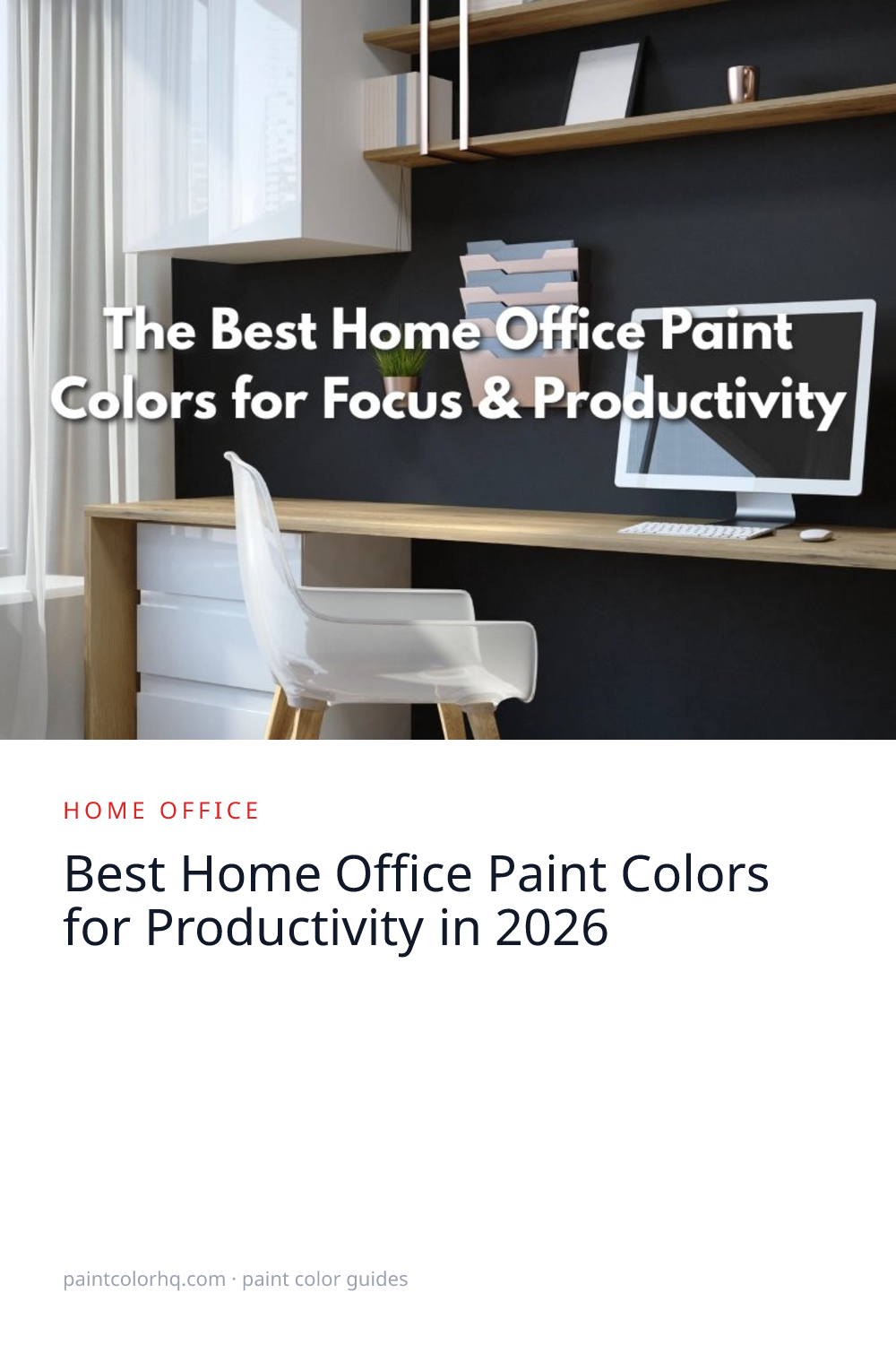

Best Home Office Paint Colors for Productivity in 2026
Choosing the best paint colors for home office productivity is one of the highest-impact changes you can make to your workspace. Color psychology research confirms that specific hues promote concentration, reduce mental fatigue, and even affect how you look on video calls. Below you'll find 13 colors across four major brands — including 2026 trending shades — organized by the type of work they support best.
Why Office Paint Color Matters for Productivity
Studies from the University of Texas found that white, beige, and gray offices increase feelings of sadness and depression — yet they're the most common office colors. Meanwhile, low-saturation blues and greens have been shown to boost focus and reduce stress. The ideal home office color is one that's calming without being sleepy, stimulating without being distracting.
The right wall color can also reduce digital eye strain during long screen sessions. Muted greens and blue-greens provide a natural resting point for your eyes when you glance away from a monitor, which is why these hues dominate the best home office paint color recommendations from designers and color consultants.
Best Blues for Focus
Blue is the gold standard for productivity spaces. It lowers heart rate, reduces anxiety, and helps you concentrate on detail-oriented work.
Quiet Moments(Benjamin Moore) — a muted blue-green that's calming without being cold. It reads as sophisticated in person and looks fantastic on camera.
Silver Mist(Benjamin Moore) — a silvery blue-gray that creates a professional, focused atmosphere. Light enough for small home offices. Browse the full blue color family.
Stonington Gray(Benjamin Moore) — technically a gray, but its blue undertones give it the focus-enhancing properties of blue while maintaining a neutral, professional look. Compare it against other options with our color comparison tool.
Dustblu(Sherwin-Williams) — a 2026 trending muted blue that balances sophistication with calm. It reads as deeply professional without being cold, and it flatters most skin tones on video calls. Browse all options from Sherwin-Williams and Benjamin Moore.
Best Greens for Creativity
Green is associated with creativity and innovation. If your work involves brainstorming, writing, or design, a muted green may be the better choice over blue.
Pewter Green(Sherwin-Williams) — a sophisticated sage-forest green that feels grounded and creative. It photographs well and works with both light and dark wood desks.
Saybrook Sage(Benjamin Moore) — a lighter, dusty sage that keeps the room feeling open and airy while still providing the calming benefits of green.
Softened Green(Sherwin-Williams) — the gentlest green option, almost neutral. Perfect for video calls where you want a warm, professional backdrop. See all options in the green family.
Hidden Gem(Behr) — Behr's 2026 Color of the Year. This smoky jade green-gray was specifically cited for reducing digital eye strain during long screen sessions. It works beautifully as a full-room color or an accent wall behind your desk.
Warm Neutrals That Actually Work
If you prefer neutrals, choose warm tones over cool ones. Cool grays and whites have been shown to increase fatigue, while warm neutrals feel more energizing.
Edgecomb Gray(Benjamin Moore) — a warm greige that avoids the “sad beige office” problem. It has enough depth to feel intentional without being distracting.
Shoji White(Sherwin-Williams) — a warm, creamy off-white that keeps the room bright and open while avoiding the sterile feel of true white. Learn more about choosing between warm and cool tones in our warm vs. cool paint colors guide.
How Lighting Affects Your Home Office Color
The direction your office window faces changes how every paint color behaves. Getting this wrong is the number one reason people repaint within a year.
North-facing offices receive cool, indirect light all day. Colors appear slightly blue and muted. Warm tones — soft yellows, warm whites like Shoji White, and warm greens like Saybrook Sage — counterbalance the coolness and keep the room from feeling dreary. See our north-facing room guide for detailed picks.
South-facing offices get warm, intense sunlight. Cool tones like Quiet Moments or Dustblu prevent the room from feeling overly warm. Colors will look 1-2 shades lighter in direct afternoon sun, so choose slightly deeper than your target.
East-facing offices are bright in the morning and dim in the afternoon. Warm neutrals maintain consistency throughout the day. West-facing offices flip this pattern — they're dim in the morning and get intense golden light after lunch. Cool blues and greens balance the late-day warmth. Preview how any color looks in your specific lighting with our room visualizer.
The Video Call Factor
If you spend hours on Zoom, Teams, or Google Meet, your wall color becomes your backdrop. Colors that look great in person can wash you out or cast unflattering reflections on camera. Here's what works:
Best on camera: Muted sage greens, warm grays, and soft blue-greens. They provide visual interest without competing with your face and they complement most skin tones.
Avoid on camera: Bright white (causes blown-out exposure), bright yellow (casts a sickly reflection), and dark colors in rooms without good lighting (makes you look like a floating head).
Accent Wall Strategy
An accent wall behind your desk (visible on camera) is a smart approach if you want color without painting the entire room. Try Naval(Sherwin-Williams) or Essex Green(Benjamin Moore) for a dramatic, professional backdrop. Keep the remaining walls in a complementary neutral.
Office Painting Tips
Use eggshell or matte finish. Flat paint shows scuff marks from desk chairs; semi-gloss creates distracting glare on video calls and screens. Eggshell or matte is the sweet spot — it reduces glare while still being wipeable. Read our complete paint sheen guide to compare all finish options.
Paint a sample behind your monitor. Observe the color while working — not just when you walk in. A color that looks great from the doorway might be fatiguing after 8 hours at your desk. Read our undertones guide to avoid surprises with lighting, and our paint sampling guide for the right technique.
Estimate how much paint you need with our paint calculator — home offices are typically small rooms where a single gallon may be enough. Use our color search to find any of these colors across all 13 brands in our database.
Frequently Asked Questions
What is the best paint color for home office productivity?
Muted blues and greens consistently perform best for productivity. Quiet Moments (Benjamin Moore 1563) and Pewter Green (Sherwin-Williams 6208) top most designer recommendations because they lower heart rate, reduce anxiety, and provide a natural resting point for eyes fatigued by screens. For 2026, Hidden Gem by Behr offers a fresh take on the productive green.
What colors should you avoid in a home office?
Avoid bright white, cool gray, and beige — research from the University of Texas links these common office colors to increased feelings of sadness and fatigue. Bright red and orange can spike stress hormones, making them poor choices for spaces where you need sustained concentration. If you love neutrals, choose warm-toned options like Edgecomb Gray or Shoji White instead.
What home office colors increase focus?
Low-saturation blues are the strongest focus enhancers. Blue reduces heart rate and anxiety while sharpening attention to detail. Silver Mist and Stonington Gray are excellent choices for analytical or numbers-heavy work. Greens promote creative focus — better for writing, design, or brainstorming roles.
Does paint finish matter in a home office?
Yes. Matte or eggshell finishes reduce screen glare and prevent eye strain during long work sessions. Avoid semi-gloss on walls — it reflects overhead lighting and monitor light back at you. Save semi-gloss for trim only.
Finding Your Perfect Home Office Color
The best home office paint color for productivity depends on your work type, lighting conditions, and personal style. Start with blues if your work is analytical, greens if it's creative, and warm neutrals if you need maximum flexibility. Factor in your window direction, test samples at your desk (not the doorway), and always check how the color looks on camera if you take video calls. Use our palette generator to build a coordinated scheme for your entire office, including accent walls and trim.
