
How to Choose a Trim Color for White Walls
Explore colors in this guide
Open a color for its details and cross-brand alternatives. Read on for the context behind each choice.
For white walls, choose a trim white that carries the same amount of yellow as the wall or less, and put it in a higher sheen. Two whites are rarely more than a few LRV points apart, so brightness alone will not separate them. For colored walls, the gap in light reflectance value (LRV) between wall and trim decides how much the trim stands out: the whites that paint makers pair with their popular light and mid-tone wall colors sit about 9 to 28 points above the wall, and a classic bright trim white on a mid-tone wall lands 22 to 35 points above it. Painting trim the same color as the walls is a third option, and it works when you want the trim to disappear.
The two numbers that decide a trim color
LRV is the percentage of light a color reflects, from 0 (black) to 100 (pure white). Every color page on Paint Color HQ lists it. The difference between the wall's LRV and the trim's LRV is the clearest single measure of how much the trim will stand out.
Yellowness matters most when the walls are white. We measure it as the b* value of each color's published color data, which is the yellow-to-blue axis of the CIELAB color space. A higher number means a yellower, creamier white. A lower number means a cleaner one.
There is no residential rule for trim contrast. The one published figure comes from accessibility rules: the UK's Approved Document M asks that door frames in non-domestic buildings "contrast visually with the surrounding wall," and defines visual contrast as an LRV difference greater than 30 points. That is a useful reference for what a clearly visible outline looks like, not a requirement for a house.
Trim color for white walls
Popular whites sit within a few LRV points of each other, so on white walls the trim is separated by yellowness and sheen rather than by lightness. Here are the common trim whites, measured:
| White | LRV | Yellowness (b*) |
|---|---|---|
| High Reflective White(SW 7757) | 92.6 | 2.9 |
| Chantilly Lace(BM 2121-70) | 90.0 | 2.2 |
| Simply White(BM 2143-70) | 89.5 | 4.3 |
| Extra White(SW 7006) | 85.9 | 2.3 |
| Pure White(SW 7005) | 83.7 | 3.0 |
| White Dove(BM OC-17) | 83.2 | 4.5 |
| Alabaster(SW 7008) | 82.2 | 5.2 |
Sherwin-Williams puts the effect plainly on its blog: cooler whites on trim "bring more contrast, sharpening and defining lines," while warm whites feel "more blended and casual." Benjamin Moore's advice is to look at the undertone of the wall color first. In practice that gives three choices for white walls.
A cleaner white for a crisp edge. Take Alabaster walls. Extra White is only 3.7 LRV points brighter, but it carries less than half the yellow, and the two rate very similar rather than nearly identical. That is enough for the trim to read as a clean line. Chantilly Lace goes further: 7.8 points brighter and cleaner still. White Dove walls are a different case: White Dove rates nearly identical to Extra White, Pure White and Simply White, so on White Dove walls those whites separate mainly by sheen. Chantilly Lace, 6.8 points brighter with about half the yellow, is the one that reads as a clearly cleaner edge. On Greek Villa or Swiss Coffee walls, Extra White is about 2 to 4 points brighter and carries less than half the yellow, and Chantilly Lace is about 6 to 8 points brighter.
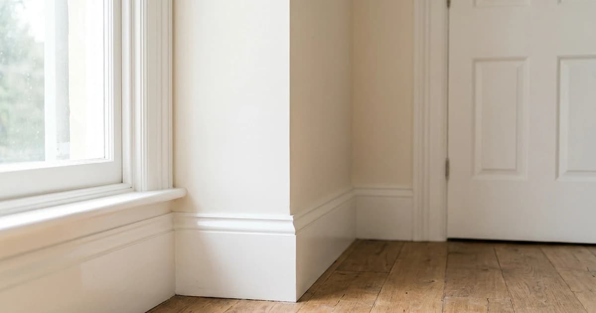
The wall white in a higher sheen. Pure White and Alabaster rate nearly identical, and so do Greek Villa and Alabaster. If the trim white is that close to the wall, you are effectively painting trim the same color, and only the sheen will separate it. That is a deliberate soft look, and Benjamin Moore's own white guide suggests painting all the trim in a home one white for continuity.
Avoid a trim white yellower than the wall. White Dove trim on Chantilly Lace walls reverses the usual order: the trim carries about twice the yellow, so the molding reads as the creamier, older surface. If you love a warm trim white, choose walls at least as warm.
Dark trim on white walls is the opposite choice. Tricorn Black against Alabaster is a 79-point gap, the strongest outline a white room can have. Our guide to black paint colors covers the black shortlist, and the best white paint colors guide compares the whites themselves in more depth.
Trim picks for popular wall colors
For each wall color below, the first trim is a white the manufacturer itself pairs with that color: from Sherwin-Williams' coordinating colors, or from Benjamin Moore's expert-picked combinations. The second is an alternative. The gap is the trim's LRV minus the wall's.
| Wall (LRV) | Manufacturer's white (gap) | Alternative (gap) |
|---|---|---|
| Agreeable Gray(SW 7029) (60.1) | Incredible White(SW 7028) (+13.4) | Extra White(SW 7006) (+25.8), also a Sherwin-Williams coordinating color |
| Repose Gray(SW 7015) (58.4) | Eider White(SW 7014) (+15.0) | Extra White (+27.5) |
| Accessible Beige(SW 7036) (57.9) | Aesthetic White(SW 7035) (+14.8) | Alabaster (+24.3) |
| Sea Salt(SW 6204) (63.3) | Spare White(SW 6203) (+13.9) | Extra White (+22.6) |
| Shoji White(SW 7042) (74.3) | Pure White (+9.4) | Extra White (+11.6) |
| Revere Pewter(BM HC-172) (55.1) | White Dove (+28.1) | Chantilly Lace (+34.9) |
| Edgecomb Gray(BM HC-173) (63.1) | White Heron(BM OC-57) (+23.6) | Chantilly Lace (+26.9) |
| Pale Oak(BM OC-20) (68.6) | Chantilly Lace (+21.4) | White Dove (+14.6), a softer edge |
| Hale Navy(BM HC-154) (8.4) | White Dove (+74.8) | Chantilly Lace (+81.6) |
| Iron Ore(SW 7069) (5.6) | Extra White (+80.3) | Nebulous White(SW 7063) (+67.9), also a Sherwin-Williams coordinating color |
Two patterns stand out. First, the Sherwin-Williams coordinating whites for its mid-tone neutrals are soft off-whites, all 13 to 15 points above the wall. Incredible White and Agreeable Gray even rate very similar to each other. Those are tonal pairings, and the trim reads as a lighter step of the wall. Second, the classic bright trim whites land 22 to 35 points above mid-tone walls, which gives the familiar crisp outline. Revere Pewter with Chantilly Lace is the only light-wall pair here that clears the 30-point accessibility mark.
Neither approach is wrong. Pick the tonal white for a calm room where the trim should not compete with furniture or art, and the bright white when the trim has detail you want to show. Sherwin-Williams names Eider White as the complementary trim for Repose Gray, so on that wall the soft option is the manufacturer's own first choice. Note that Benjamin Moore does not label any color in its combinations as trim, so its pairings above are whites it groups with the wall rather than trim instructions.
For dark walls like Hale Navy and Iron Ore, any of these whites sits 76 to 83 LRV points above the wall, so every option gives a strong outline. Pick the white that already runs on the trim in the rest of the house. To check any other pair, put the wall and trim colors side by side in the color comparison tool, which shows both LRVs and how close the two read.
Painting trim the same color as the walls
Painting the trim the wall color makes the trim recede. It suits small rooms, rooms with plain or builder-grade trim you would rather not highlight, and color-drenched schemes where walls, trim and sometimes the ceiling all share one color. Sherwin-Williams has a whole project on it: "painting the walls, doors and trim the same color in different sheens," with flat walls, satin trim and semi-gloss doors.
The sheen decides how it reads. Sherwin-Williams' color team notes that you need a broad sheen difference for the eye to notice it, and that if you want the room to appear as one continuous color you should paint everything in the same sheen. Farrow & Ball, which calls the approach color drenching, recommends a single finish across every surface.
Pros and cons of painting trim the same color as the walls:
- Pro: no contrast line to cut in. A slightly wavy edge where trim meets wall is invisible when both are one color, which makes the job more forgiving.
- Pro: one color to buy and touch up. You still need the trim in its own sheen, but the color is the same.
- Pro: fewer outlines. Doors and windows stop breaking up the walls, which is the point of a color-drenched room.
- Con: detailed trim disappears. Benjamin Moore notes that painting crown molding the wall color may hide its details. If you have good millwork, a contrasting trim shows it off.
- Con: one sheen means less durable trim. Benjamin Moore points out that higher sheens offer more durability and stain resistance. Trim in a flat wall finish is harder to wipe clean.
Whatever color the trim ends up, its finish matters as much as the color. Benjamin Moore lists satin, semi-gloss and high gloss as the popular trim sheens. Our paint sheen guide explains which finish suits which surface.
How to test a trim color before you commit
- Look up the wall color's LRV on its color page, then the LRV of each trim white you are considering. Work out the gap.
- Decide what you want: tonal (about 9 to 15 points), crisp (20 to 35), or a strong outline (dark trim or a dark wall).
- For white walls, compare yellowness instead. Pick a trim that is as clean as the wall or cleaner.
- Preview the wall and trim pairing in the room visualizer, or build the whole scheme, including an accent and a door color, in the palette generator.
- Paint a sample of the trim color on a board and hold it against the actual wall and molding, in daylight and at night.
Browse more options in our white, off-white and gray color families. Every color page shows its LRV and its closest equivalent in other brands, so a trim white you like in one brand can be bought in another.